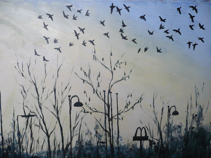
Jackdaws At Dusk

Jackdaws At Dusk

Monday, 28 February 2011

Eugene Carriere


Eugene Carriere 1849-1906, Maternity. Oil on Canvas. 44 by 54cm. Location Musee des Beaux-Arts, Reims, France. From the Bridgeman Education Site.


I've seen one of Carriere's paintings in the National Museum and Gallery of Wales around three years ago, and the image was so striking for the deep shadowy areas and the piercing section of light.


I saw this image on the Bridgeman site and had to put it here. My portrait project at the moment is taking elements from Carrier's work, most notably the tonal contrast, limited palette, hazy light and the subject of children. Mine is of my son asleep so the lighting conditions are perfect for creating this kind of hazy effect, especially as I've been using my daughters night light torch to highlight areas of his face. The painting is more than life size and is interesting for the challenges it poses.


This painting of Carriere's is captivating for the swirling movement in the forms of the figures, creating a perfect curve up and around and back again. Swimming in a sea of sepia toned background the highlights of the features stand out like ghostly forms.

I've seen several versions of this composition, some are called studies and some look like a "finished" painting, so this image obviously captivated him. What I also love about his paintings, which I'm bringing out in my version too (after having painted most of my project with really thick paint recently), is the thin use of paint and how the canvas shows through in areas. It creates such a strong contrast between the areas of the figures and faces that have been painted so beautifully life like and then breaking through that illusion of life is the flicker texture from the canvas.

Friday, 18 February 2011

Augustus John (1878-1961)


Edwin John by Augustus John 1911. Oil on Canvas. Owned by the National Museum of Wales, Cardiff, from the Davies Sisters Collection. Painted when Edwin was about six years old.


Edwin John 1940 by Augustus John. Oil on canvas. 52 by 48cm. Owned by the Fitzwilliam museum, Cambridge University. Copied from the Bridgeman Education site.

PORTRAIT PROJECT

I've recently been to the National Museum and Galleries of Wales in Cardiff to get a flavour of the different portrait styles there that could be incorporated into this portrait project. Thanks to a new wing having been recently opened in the Museum there is now a huge section of paintings from the 1900 onwards that are available to view.

Augustus and Gwen John stood out as the highlights for me of this new section. It was wonderful to see the paintings by Gwen on display having previously only seen them in the vaults of the museum when I visited there in May 2010. It's charceristic to see the backgound only partly blocked in, indeed it's unusual to see one of his paintings that has all of the canvas covered in paint. The 29 years that seperate these two paintings here don't show much stylistic differences, the later is slightly more loose, but there is still the emphasis on observation coupled with expressive application of paint. It's these elements that I will aim to bring out in my own painting for this project.

A separate room was also filled with drawings and etchings by Augustus John and I copied a couple for my logbook. The sketches and etchings also show elements of closely observed draughtsmanship coupled with free and loose use of line.


The top painting of Johns son Edwin is on display in the museum in Cardiff, along side several others of Johns family, friends and admirers. What struck me about this image was the vivid colours and the confident pose of the young boy. Information on the wall said that his mother, Ida John, thought of the boy as ugly with small blue eyes. In another room at the museum there is a sculpture of Romilly John, Edwin's brother, carved by Eric Gill. Romilly also shows the characteristics that his mother thought of as "ugly" but it strikes me as strange that what she viewed as ugly, his father and Gill thought of as art, enough that they created paintings and carvings of them. When I was in the museum I sketched the images of these two boys, one by John and one by Gill, for my logbook.

The second painting of Edwin above shows him at the age of 35, a handsome and striking man. A further historical fact about Edwin is that it was his aunt, Gwen John, who encouraged him to become a watercolour artist after a brief career as a middleweight boxer. After her death "he inherited the estate of his aunt Gwen and did much to secure her posthumous reputation." (From the Museum of Wales website, link below.) http://www.museumwales.ac.uk/en/art/online/?action=show_item&item=902

The Museum in Cardiff owns 126 paintings by Augustus, including a further 2000 works on paper by both Augustus and his sister Gwen. Born in Tenby West Wales it is fitting that the Museum of Wales is justifiably proud of these Welsh artists.

Tuesday, 11 January 2011

Elfyn Lewis

http://news.bbc.co.uk/local/northwestwales/hi/people_and_places/arts_and_culture/newsid_8726000/8726798.stm

Just had an "Ah ha!" moment. Following links about Brenden Burns from Google led me to reading an interview with him, which I added to my post about him previously, where he mentions Elfyn Lewis winning the Welsh Artist of the Year award, the first painter to win it since 2005. Googling Elfyn Lewis then led to me to sites featuring his paintings and I immediately recognised them as the work of an artist I saw in the Eisteddfod last summer, 2010. They were only small paintings but caught my eye because of the unbelievably thick layers of acrylic paint used. The canvas was on a thick stretcher, about two inches, and the paint had been allowed to dribble down the sides, he must have painted on them horizontally. The site I've linked to above quotes him as saying he uses Squeegees, trowels and even cassette tapes to scrape the paint from top to bottom or left to right. The paintings that I saw in the exhibition had what looked like at least ten layers of paint layered one on top of the each other, and each one looked to have been left to dry before adding another layer. They were so tactile because they still looked wet and fluid. I felt too self conscious to have a go at copying the colour etc used in the painting into my sketchbook because there were so many people there (a pathetic excuse I know) but the memory of seeing the paintings is still very fresh in my mind.

http://www.bbc.co.uk/news/10322630

This link is to a BBC page which shows and talks about the winning painting for the Welsh Artist of the Year, and also mentions winning the Gold medal for Fine Art in the 2009 Eisteddfod in the Bala. This is obviously an artists to keep an eye on and I'm glad his paintings caught my attention.

http://www.elfynlewis.com/index.php?lang=cym&status=3


Here's his website, with a huge collection of his paintings. One of the paintings that I remembered seeing in the Eisteddfod was similar to Cae Melyn (Which means "Yellow Field" in Welsh). I just remember that intense yellow colour. I also remember something similar to Carno which had a small section in the top layer that only partly covered the thicker layers underneath, allowing then to show through.

Wednesday, 5 January 2011

Lucian Freud Tenby Harbour 1944


Lucian Freud Tenby Harbour 1944 From Oriel y parc website, St Davids, West Wales.


Watercolour, crayon and charcoal on Ingres paper. It will be on display in the gallery until the end of March, 2011.


What surprised me is how little has changed from my version that I did of Tenby Harbour after going on holidays there last summer.


It looks like he was much higher up on the cliffs doing his version as the harbour wall and houses are seen from above, whereas as mine is ground level. Mine also shows the new addition of some kind of ramp that much be used for the life rafts.

Wednesday, 3 November 2010

The Finished Landscape Painting

This is the final painting for the Landscape project, which I think shows a wide variety of marks, tones and colours to make it an interesting painting of an interesting feature. The photo of the profile of the painting shows the amount of texture added both from old paint glued onto the canvas from an old palette plus fresh paint that was applied using card. It's funny how techniques from the Collage project have fed through into this project, because if I hadn't have experimented with techniques suggested by Mike Bernard then I would never have thought to paint using card for the rock face.


This bottom photo shows a work in progress where I wasn't happy with the colour of rocks as they were too yellow. Brightening the rock face using more white and Cerulean Blue has made such a difference to suggesting the form of the cliff.


Monday, 1 November 2010

Development of the Landscape Project


This is the painting at the moment shown alongside one of the photo's I took of the cliff-face. I'm not working from the photo's now I'm back home but am continuing to work from the sketches and studies that I did. I'm not aiming for photographic realism either, but just want to show how it's the essence of the rocks and their solidity that really drew me to this as a subject matter. The fact it's such a high horizon line and that the rock occupies most of the composition makes it an even more impressive feature.

Friday, 29 October 2010

Landscape Painting.

During a recent holiday at the beginning of October to Tenby in West Wales I was struck by a cliff at the back of our caravan which seemed so out of place next to the rows of neat white caravans. So I took it upon myself to make some studies of it and to see if it could be developed into a painting. This A3 oil pastel sketch from my sketchbook shows the composition I wanted to use along with a more expressive rendering of the colours and plant forms. I was thinking about Peter Prendergasts' work at the time and the strong use of black contrasting with the light tonal areas shows his influence.


I filled a few pages of my sketch book with compositional studies and once I'd decided on the right angle I painted this A2 study. It contains a more accurate rendering of the colours in the rocks face and shows detail for the cracks and fissures and plant life, but I was hoping I could bring out more texture in the finished painting. The oil pastel sketch above contains much more dynamic marks that I was hoping to bring out too, rather than the flat smooth brush marks.


After having experimented with using lumps of old acrylic paint scraped off old palettes in my John Piper style painting I decided to try the technique again for this painting. This photo shows the painting viewed from the side showing where I've placed the textured areas in the middle, corresponding with the rock face. The vivid colours that I've used for the under painting will hopefully feed through into the top layers which will be slightly more "realistic." I'm still hoping to work somewhat in the style of Peter Prendergast.


Another layer of paint has been added here with areas scraped through into the bottom layer such as the plants on the bottom left corner and the rock face. The sky has had another layer added to it using a palette knife and thin layers of white, blue and red. Even though the photo doesn't show the colour of the sky very effectively I'm happy with the effect here and probably won't change it much in future alterations.

The colours for the rocks and plants are still not very life like as my main priority at the moment is still to achieve unusual texture in the undercoat. I'll work more at adapting the colour once I'm happy with the texture.