Jackdaws At Dusk

Jackdaws At Dusk

Wednesday 3 November 2010

The Finished Landscape Painting

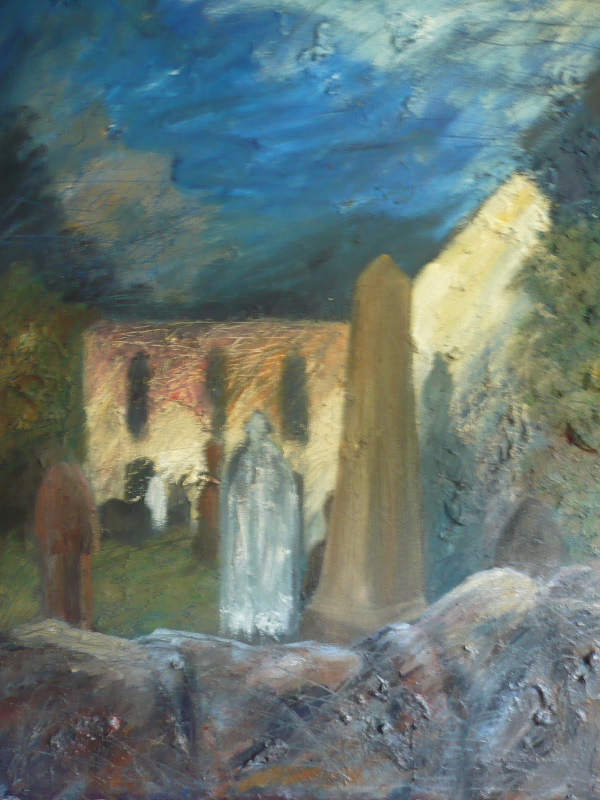
This is the final painting for the Landscape project, which I think shows a wide variety of marks, tones and colours to make it an interesting painting of an interesting feature. The photo of the profile of the painting shows the amount of texture added both from old paint glued onto the canvas from an old palette plus fresh paint that was applied using card. It's funny how techniques from the Collage project have fed through into this project, because if I hadn't have experimented with techniques suggested by Mike Bernard then I would never have thought to paint using card for the rock face.


This bottom photo shows a work in progress where I wasn't happy with the colour of rocks as they were too yellow. Brightening the rock face using more white and Cerulean Blue has made such a difference to suggesting the form of the cliff.


Monday 1 November 2010

Development of the Landscape Project


This is the painting at the moment shown alongside one of the photo's I took of the cliff-face. I'm not working from the photo's now I'm back home but am continuing to work from the sketches and studies that I did. I'm not aiming for photographic realism either, but just want to show how it's the essence of the rocks and their solidity that really drew me to this as a subject matter. The fact it's such a high horizon line and that the rock occupies most of the composition makes it an even more impressive feature.

Friday 29 October 2010

Landscape Painting.

During a recent holiday at the beginning of October to Tenby in West Wales I was struck by a cliff at the back of our caravan which seemed so out of place next to the rows of neat white caravans. So I took it upon myself to make some studies of it and to see if it could be developed into a painting. This A3 oil pastel sketch from my sketchbook shows the composition I wanted to use along with a more expressive rendering of the colours and plant forms. I was thinking about Peter Prendergasts' work at the time and the strong use of black contrasting with the light tonal areas shows his influence.


I filled a few pages of my sketch book with compositional studies and once I'd decided on the right angle I painted this A2 study. It contains a more accurate rendering of the colours in the rocks face and shows detail for the cracks and fissures and plant life, but I was hoping I could bring out more texture in the finished painting. The oil pastel sketch above contains much more dynamic marks that I was hoping to bring out too, rather than the flat smooth brush marks.


After having experimented with using lumps of old acrylic paint scraped off old palettes in my John Piper style painting I decided to try the technique again for this painting. This photo shows the painting viewed from the side showing where I've placed the textured areas in the middle, corresponding with the rock face. The vivid colours that I've used for the under painting will hopefully feed through into the top layers which will be slightly more "realistic." I'm still hoping to work somewhat in the style of Peter Prendergast.


Another layer of paint has been added here with areas scraped through into the bottom layer such as the plants on the bottom left corner and the rock face. The sky has had another layer added to it using a palette knife and thin layers of white, blue and red. Even though the photo doesn't show the colour of the sky very effectively I'm happy with the effect here and probably won't change it much in future alterations.

The colours for the rocks and plants are still not very life like as my main priority at the moment is still to achieve unusual texture in the undercoat. I'll work more at adapting the colour once I'm happy with the texture.

Tuesday 26 October 2010

Brendan Stuart Burns

http://www.brendanstuartburns.co.uk/paint_perspex.htm

This link is to the paintings on the website of Brendan Stuart Burns, a contemporary Welsh artist who's won the gold medal in Fine Art twice in the National Eisteddfod of Wales, and who I knew as a tutor on the Fine Art section of the Foundation Course in the Glamorgan Centre of Art and Design Technology when I studied there in 1997. At the time I wasn't very aware of the paintings he created, there were two on display in the National Museum of Wales in Cardiff at the time, but I didn't really understand them. They were so large and didn't seem to be depicting anything specifically that it was difficult for me to see what was going on in them, especially as I'd never studied anything in this style before.


I've since read about his work in more detail in the book "Welsh Artists Talking" by Tony Curtis which was published in the year 2000, which contains interviews with various artists about their work. I now see his paintings differently, the key reason being the piece of information relayed in the book that the paintings are depictions of the beach on the Pembrokeshire coast in West Wales seen from looking down at the ground. Many of the paintings are of rock pools, seen close up, and the use of perspex and wax along with oil paints recreates this gloopy, liquid world. The colours and forms are of the rocks, sand and plant life and once I read this I saw the paintings in a different way. It reminds me of the work of Peter Lanyon, who I've written about in my paper logbook, and the fact that he painted many of his images from the scenes he viewed when flying across the coast of Devon and Cornwall in his glider. Both artists are creating landscape paintings though seen from a very different angle.


I've recently seen more of his work at the National Eisteddfod of Wales this year in Ebbw Vale, where he had three large paintings on display, but not so typically depicting rock pools and the coast line. They were in a square format, quite dark, and used a lot of purple and unusually contained a fair amount of glitter which was visible when viewing the work from the side. Maybe this was meant to depict the sparkle of the water. They were very tactile and invited you in to view them both close up and from a distance. There was the hint at some kind of representation but it was as though seen through a veil.


The link here is for the paintings by Burns owned by the National Museum of Wales in Cardiff, though they aren't on display at the moment. However I have seen two of his paintings, quite small ones, that were on display the last time I visited the museum a couple of months ago, but they were on loan from the artist. I remember them being slightly different to the rock pool paintings, and the use of paint seemed quite sparse, with more of an inclusion of blobs, maybe they were meant to be the rocks. I will make some studies of them next time I go to the museum, which will be quite soon.

(added info on 11/1/11) The paintings are not there anymore, they've moved a lot of things about, but more information on the web shows them to be part of " The Taste of Sight" collection of paintings. The small ones, 15cm by 15cm are in my price bracket and are very tempting. "These paintings strive to 'touch' you" he says in a statement on the 56groupwales website, where he is one of the artist members. "The constant struggle and dialogue with the abstract and the figurative, empathise with the process of nature found within both microcosm and macrocosm." I can remember his doing a session on synaesthesia in his art classes back in 1997 and he mentions synaesthesia in the website statement too. The tactile quality of paint must be such an integral part of the painting process for him.


This interview is related to an exhibition of his in Oriel Myrddin, featuring work that he completed on a residency in Oriel Y Parc in West Wales. When asked what he loves about painting he says "The smell, and the fact you can't master it and what it can do." Which is quite a humble and realistic standpoint really.


Here's list of artists who he mentions on the website for Oriel Y Parc in West Wales where he had a residency in 2009. He was able to select paintings by these artists from the collection of the National Museum of Wales to be exhibited next to his work when on display in the Oriel Y Parc; Frank Auerbach, Howard Hodgkins, Ceri Richards, Sean Scully, Ben Nicholson, Eugin Boudin and Thomas Jones.

Monday 25 October 2010

Peter Prendergast


Peter Prendergast, "Autumn Evening Towards Penrhyn Castle" 1994. Acrylic on Canvas. 106.7 by 61 (website didn't say inches or centimeters but I'm assuming it's cm) Copyright the Bridgeman Education Site.


New project time; "Landscape."


This little beauty of a painting is by Welsh artist Peter Prendergast. He grew up in South Wales and then spent the majority of his career up in North Wales. The two landscapes of North and South being very different is interesting to note, South being more rolling valleys and North being more rugged mountains. This painting, even though painted "Up North" has all the rolling hills of the South (where I live) so I wonder if he was never quite able to shake off his roots.


I had a little chuckle to myself when I felt saw this image on the Bridgeman site yesterday because they'd displayed it the wrong way up. It was lying on it's side and needed to be rotated anti-clockwise. I contacted them and told them and within 24 they'd sorted the problem, very efficient. It just makes me wonder that with the expressive style on this painting that maybe at first glance it looked like it should have been displayed that way! (Try looking at it with you head bent to the left, it still looks like a good painting. Even Kandinsky didn't recognize one of his own paintings when he saw it displayed upside down.) However I knew it should be landscape format because of the hint of horizon, and the contrast of bluish colour for the sky and greenish colours for the ground.


I did an A3 version of one of his paintings very similar to this in my paper logbook. It was very satisfying to paint. Thick, gloppy acrylic paint and intense unreal colours with such strongly contrasting tonal areas. It only took my five minutes to paint it because I wanted to keep the expressive style. He always painted outside too, so the weather affected his paintings very strongly as can be seen from the stormy skies in the painting above. There are seven paintings of his owned by the National Museum of Wales in Cardiff so I'll be making an appointment to see them in the vaults, unfortunately they aren't on display in the galleries. Seeing his paintings in the flesh will be very interesting.


It's worth pointing out that he was taught by Frank Auerbach in the Slade in London, and has been accused of copying his tutors style with his use of thick black outlines, but seeing paintings that Prendergast created when he was a teenager (which I saw reproduced in the book on Prendergast's work "The Painters Quarry") shows very clearly that he had this thick and heavily outlined style before he'd even stepped foot in the city.

Sunday 24 October 2010

Paper Mosaic Collage


I'm feeling very honoured to have had comments on a few of my posts here from Ellen Golla herself after having found and joined her own blog site which she then followed the link back to my blog site. In honour of that I thought I'd include photo's of the paper mosaic collage I created inspired by her images.


I created this collage mosaic based on a sketch I did of the light patterns from a lamppost that had grown up into a tree. The image by Ellen Golla that fed into my version was "I'd Drown Looking for You" which I found on her website and did my own sketched version above. It was the flow of mosaic pieces that really caught my eye, along side the contrast of the vibrant and shinning colours in the centre surrounded by the darker shadowy areas. My own version tries to tie in these elements of flow and vibrant colour. The allusion to fire is something that I'm happy with because Ellen herself also uses a lot of fire images in her own work, which makes me wonder if it has symbolic meaning for her.


My comments in the previous post about her work mentioned how labour intensive I found doing this image. I took about four hours to do this small A3 size image, working for an hour each time for four different sessions, most of the time taken up with cutting the pieces. Towards the end of the piece, for the areas down the bottom, I tried to short cut the amount of time spent cutting by folding the paper a few times over and cutting through five or six layers at the same time. The saved on time but ended up with irregular shaped pieces and sometimes picked up on colours in the magazine scraps that weren't quite right. The pieces in the middle of the image were cut individually so it features little detailed pieces that I wanted to include such as the tiny little slice from a cello showing the f shaped sound hole. There's also sections in the darker areas with pieces from birds and animals, because the magazine that I used primarily was the Royal Society for the Protection of Birds magazine, but I quite like their inclusion, as it's a bit like a jigsaw puzzle.


When I featured Ellen Golla's piece "Tea Time With Gordy" a few posts back she was kind enough to comment that she had taken a few months to finish the piece, working on the piece for a little while each day, which is quite amazing. It was also really nice to find out from her that the foreground images, such as the tea set and the swans were indeed taken from photo's she'd taken and placed on top of the mosaic pieces, which is what I'd thought from studying it. Having her feedback has been invaluable and I'm very grateful.

Wednesday 20 October 2010

More about the Seeds

I've just watched half of an accompanying video that is featured on a link on the Tate site. Interesting that they show footage of the miners, considering the comments I made on the previous post. Dust is seen rising from the seeds at the very beginning of the footage when Weiwei is seen sweeping them smooth. Was he warned about that because of Health and safety?


Footage of the place where the seeds were made mentions the fact that it used to make porcelain for the king, but now most people have gone bankrupt. Seeing Weiwei walking around each one of the workers as they are painting away is like watching a king among his subjects. They view him with the same kind of adoration and respect, because he is the one bringing money into the area.


The sheer monumentally of the work just makes my head spin. The numbers of seeds involved, and the numbers of workers that go into making each seed, mining the rock, making the porcelain, making the moulds, painting each seed. And when they're all seen together they sink into their own vastness. Each one is the same, none of the workers would be able to pick one up and say"I painted this one". It's like a metaphor for our lives in a way. We are just like the seeds, that when seen from a distance we just blend into the vastness of the whole.


Just watched a little more of the footage and the sunflower seeds are indeed meant as a symbol for people. Chairman Mao was always depicted surrounded by Sunflowers, because he was seen as the sun and the followers were the sunflowers. The numbers and the fact that everyone is doing the same thing reminds me very strongly of footage from countries such as China and Korea where you have vast numbers of people that stick together as a unit and perform perfectly and in unison. The same sort of behaviour is not expected over here though. I remember the closing ceremony of the Beijing Olympics where London did a performance to signal them taking over in 2012 and it just looked like utter chaos with everyone running around doing random things, and all this next to the precision of the performances from China. Neither are perfect though, and we each have our own problems in our own way.

Ai Weiwei in the Tate Modern

I briefly saw a story on the telly about this installation and the angle of the article was ridicule towards it and the fact that it had been branded a health and safety hazard. Well there no such thing as bad publicity and the work by this artist has made it's way into more people's awareness because of the "hazard" than if it had been branded completely safe. So I decided to look it up and read into it in more detail.


What I, and probably every person who sees it, thought were real sunflower seeds turn out to be individually made out of porcelain by workers in the Chinese city of Jingdezhen. This immediately brought to my mind the impossibility and the monumentality of the task. How on earth did they have the patience to create these millions of seeds? The work is meant to make us think about the issue of almost everything being "Made in China." As a child of the late seventies I can remember toys that were "Made in England" and then the cheep influx of imported goods. It's very rare to see anything with a "Made in England" stamp anymore.


Then the issue about health and safety is mentioned in more detail in the write up on the Tate site which refers to the dangers of inhaling dust from the porcelain which would have been ground up by the viewers to the exhibition, who seemingly would have been allowed to walk all over the seeds. But then it brings to my mind the fact that these workers who made the seeds would themselves have been exposed to the dust.


The recent activities in Chile with the rescued miners makes me realise the fact that until recently my home town was itself a mining colliery, now closed down, and maybe it is the wave of Health and Safety that helped to shut these dangerous places down. But the fact that we now refuse these jobs mean that other countries with different standards end up taking over jobs that still pose dangers. And now we're a country with very little industry and huge debts.


So what started off as a complex exhibition in the first place is now a place for even more thought.


Friday 8 October 2010

Joseph Cornell


Soapbubble Variant c.1956 Mixed Media. From the Bridgeman Education Site.


Untitled c. 1960 Joseph Cornell. Collage on Masonite Board. From the Bridgeman Education site.


Although for some people the image of a naked woman lying on the grass would catch their attention, for me it's the image of Caerphilly Castle in the background! I'd know that castle anywhere, it's just down the road from me and I've stood underneath that precariously balanced section of wall - a Welsh Leaning Tower of Pizza. Not only is it surreal that a naked woman is outside having a picnic, but to me it's also surreal that an American artist would use an image of a building from Wales.


http://www.aaa.si.edu/collectionsonline/cornjose/
This link is to the papers written and compiled by Joseph Cornell throughout his entire career and it's really interesting. There's twenty five pages of stamps that he collected, as many of his Shadow Boxes included stamps in them. They must have had an important relevance for him. The website says there's twenty five linear feet of papers that the artist collected, either as business correspondence or artistic references. There's also 66 linear feet of artifacts that were directly related to the shadow boxes and collages that he created. Incredible. You could spend hours just on this one site alone, sifting through the reams of information.


He was obviously a man with a finely tuned visual sense, with nature and humans seeming to occupy the majority of his symbology. The image above for Saopbubble Variant refers to the interest he held in celestial affairs. One of the stamps used in the top left hand section, of the little girl, has also been used in another of his shadow boxes, Untitled 1950, which I saw in The Art Book by Phaiden, which just shows how much relevance he attaches to all these different images, and how deeply they've entered his visual language.


This link has a huge list of photos to look at. http://www.ibiblio.org/wm/paint/auth/cornell/

Monday 20 September 2010

Collage Artist


"The Letter" 1994 Mixed Media. Nissan Engel. From the Bridgeman Education Site.

I've just done a search for "collage" on the Bridgeman site and it's come back with 1042 results, including many from the Dadaists which I will be looking into more detail to come. However the images that caught my eye were all by the Israeli artist Nissan Engel and there were many by him. So for now I just wanted to include this image by him. I love the rich colour and the textures created by the ripped paper. I also love the inclusion of manuscript paper which personally I find exciting because I play piano so I'm always wondering what the pieces sound like, but also the patterns of the black dots and lines adds another level of interest to the textures. I'm planning on experimenting with manuscript paper myself, but I find it hard to contemplate ripping up real manuscript paper so will probably photocopy some sheets and then age them by painting over them or staining them with teabags.

Robert Tilling


http://www.davidsimongallery.com/Artists/Tilling.htm I've just been doing some looking around the Internet for information on Robert Tilling, whose one of the artists with work featured in the course book for the "Collage" project. This was one of the interesting sites I could find on him. It wasn't what I was looking for though, and I was a bit disappointed that there wasn't one mention of him using collage in his paintings. All of the images featured, whilst similar in subject matter to the "Distant Headland" which I first saw in the course book and I've included above from the Bridgeman Education site, are actually completely different in their colour scheme, because "Distant Headland" features very subtle gradations of tone in a monochromatic colour scheme whereas the paintings featured in the websites are very vibrantly coloured.


The website http://www.thisisjersey.co.uk/art/roberttilling/index.html says that he works "primarily in watercolour, acrylic, gouache and charcoal" and another website http://www.mallgalleries.org.uk/index.php?pid=113&subid=220 features an artists statement by him which says that "my work is based on observation and memory, where chance and accident play an important role. I often work very quickly paring down my ideas to abstraction." This site features some very interesting images that are more vertical in their orientation, as opposed to horizontal like the landscapes, and the vivid purples oranges and blues work really well here but area again very different to the painting featured in the course book.


I have to say I much prefer his monochrome "Distant Headland" and will be interested to have a go at mocking up this image in my own logbook just to see what I can learn from his technique. I really like the way he's used heavily textured watercolour paper, which he's painted on top of, then ripped the edges, creating a ragged white line against the mottled greys layered up underneath. These subtle horizontals and diagonals are all that are needed to suggest the bands of the horizon on the coastline.

Sunday 19 September 2010

Picasso and Las Meninas and "Art From Art"

I've managed to find a website featuring the work of Picasso in the Picasso Museum in Barcelona. http://www.museupicasso.bcn.es/eng/collection/cont_collec.htm#p13 It contains a lot of information that I haven't been able to come across before and is very interesting, especially the reference to the "laboratory" he set up in order to better study three great paintings by Velazquez, Manet and Delacroix.


The Wikipedia page on the original painting by Velazquez also goes into some detail into the tributes paid to it by Picasso. It says that he created 58 paintings based on the painting Las Meninas between August and December of 1957. The Picasso Museum site says that he sought to create "a group of canvases with a common theme" which surely he was already doing to a certain degree, though the fact that he created 58 paintings in total takes it into a different league. He took the original composition and added his own unique style to it, which is what the website says at the end of the article, in that "the big difference between Velazquez' painting and the Picasso's is in its aesthetics."


http://www.guardian.co.uk/artanddesign/2009/feb/24/picasso-national-gallery This article in the Guardian is really interesting because it reviews an exhibition that went on in the National Gallery in February 2009 which featured many of Picasso's paintings that had been based on Old Master work. There's also a feature on the side of the web page called "More on this Story" which goes to another page featuring a gallery of Picasso images, including several that were base on Manet's "Luncheon on the Grass," one of which I used for my Logbook. The only criticism that I came across regarding the exhibition was the fact that the Old Master paintings weren't included in the same rooms as the Picasso's, whereas in Paris where the same exhibition was shown it included the original paintings right next to the Picasso's. This would have been fascinating to see which elements of the painting he decided to keep and which he decided to evolve in his own style.


It makes me look at the project we've been doing in a different way. We were asked to paint in the style of another artist, of which I chose John Piper because of the theme of a ruined building. However what the artists I've looking into for the logbook/contextual studies are artists who have taken an original painting by another artist and vastly changed its style, or aesthetics. The example that really sticks in my mind is the version created by Leon Kossof, which I copied into my logbook, where he took a painting by Rembrandt and painted it as only he could using tremendously thick paint and vivid outlines, in dramatic contrast to the refined, smooth depiction of flesh by Rembrandt.


"ART FROM ART"


However whilst looking around for other examples by artists of working in this way I also came across painting that had been copied almost exactly as they appeared in their original form. There were a couple featured in the book "Paint; A Manual of Pictorial Thought and Practical Advice" byJeffery Camp, the most striking being the painting "after Cezanne, The Black Clock" by Leonard McComb from 1988 on page 43 which has been painted wonderfully, with a vibrant splash of thick colour depicting the curve of the enormous conch shell which is featured next to the black clock from the title. But when seen next to the original by Cezanne, from 1870, it's almost an exact copy, there's slightly more colour and texture in the McComb version but there's still very little difference. The Cezanne painting itself is notable for it's early placing in Cezanne's career, coming before his mature phase of the 1890's, and looks quite flat and with a very heavy inclusion of black paint. McComb also copied part of Bonnard's "Paysage du Cannet" which was also featured in the book "Paint" on page 69, and this too differs very little from the original.


The quote from the course book "art comes from art, not from nature" has stuck with me throughout doing the "art from art" project and I've found that my opinion has changed slightly, aiming now towards agreeing with the quote to a certain degree. The other quote which comes back to me in relation to this is by John Piper, who was in turn inspired by William Blake who wanted art to occupy it's own sphere, just like poetry and music. It makes me think that music, in the way that people create it, is itself removed from nature, it obeys certain rules of harmony and vibration which are dictated by nature and physics, but is free to distort and branch off in many directions. This also is now true of art and painting, and it has indeed started to occupy it's own sphere.


This brings me back to the differences between what was asked of us in the project, to copy another style, and the different forms of copying that I've seen in other artists, and the most successful ones being those who can rake another image and make it their own. After all what I've been doing in my own logbook is to copy directly the work of other artists, and whilst this is interesting to find out more information about composition and colour mixing I would in no way consider this to be art.

Friday 17 September 2010

Ellen Golla


http://zebracrossing.org/ I thought I'd do a link here to Ellen Golla's website. I've written about her in my sketchbook for two different projects, "Animals" and "Collage" and I just love her images and little constructions. The tiny books in little medicine capsules are amazing, how on earth would you make them? The quote by her on the first page is very inspiring, "I love the scent of paper, the textures of paper, and the endless possibilities of paper. My paper mosaic collages are intricately composed of hundreds of little bits of cut paper," and in an image like "Tea Time with Gordy" which I've included above from the Bridgeman Education site, it perfectly shows off each one of these tiny slices of paper, stuck together to suggest the movement of water, rushing the collection of tea set pieces, including a swan in a tea cup, over the edge of the table, like a waterfall, where they will surely crash. There's usually a slightly Surrealist element to her images, such as the swan in a tea cup, or maybe it's just there to show her sense of humour.

I've experimented with her way of working for the project "Collage" and found it to be very labour intensive, and I didn't even cut the pieces as small as she does. In the end I found that combining paper and paint, such as Mike Bernard's method was much more to my liking, but I'm glad that I experimented with a few different ways to find out. From studying this image above I imagine that she used the collage mosaic method for the background but used whole images for the tea set, as they look too perfect and smooth to have been constructed from many small pieces of paper. Her website says that she often uses her own images so I guess that's what she did here and took photo's especially for this composition.

Wednesday 15 September 2010

Detail of the Final Image


I wanted to take close up photo's of the final painting to show in better detail the textures in the use of paint and paper. I found that they also created interesting images and compositions in their own right, so I've included a few examples here.

The Final Image

I have to say I'm really happy with the success of this image and am pleased with how far it's taken me out of my comfort zone as I'm more accustomed with painting in detail.

This final stage saw me adding splashes of colour to the darker areas in the top right and bottom left hand corner, similar to the splashes of green in the watercolour sketch. This has helped to lift the darker areas whilst also emphasising their tonal differences. When compared to the previous photo the contrast is quite large.

The use of collage as a technique is one that I will definitely use again, as the possibilities are vast especially when used in combination with paint. In my sketchbook I've experimented with more abstract images plus landscape compositions and in a way this final image here is like a cross between the two, there are elements of abstract and natural representation within it.

The one area of weakness that I can see in the final piece is that maybe the composition is slightly too straight forward. The flowers are laid out in two horizontal rows, and maybe there could have been more movement here. I think this fault has come about by not planning enough at the beginning stages, and laying the coloured paper areas out without considering their relation to each other in the composition. Once it got to the stage that I could see there was a slight problem I didn't feel confident enough to be moving the areas around without affecting how it already looked. There is a fine line between chaos and order and maybe the beginning stage was a bit too random, so I will know to plan more in the future. However the dynamism of the paint and collage effects more than makes up for the slightly tame composition, in my opinion.

More Colour

Here I added more colour for the flowers, using both acrylic paint applied with card and small strips of coloured paper. I like the way it's given more definition to the flowers without making them look too cut out and neat. I've also darkened the background, using mostly paint, to add more tonal contrast, something that is very striking in Bernards images. Even though the original watercolour image didn't have this much dark paint it still benefited from the lighter area surround the painting, which this painting doesn't have, so I think that the darker blues and purples in the corners is helping to bring the flowers into greater focus.

I'm also worried that the dark paint is slightly too dark so am contemplating adding lighter areas on top, maybe in the form of dragged paint using the card, as I've done in other areas, but am thinking of splatting paint on top, using white and yellow. The original watercolour featured splattered green paint which crossed over into the pale paper and I think added more interest to the image, so I will see how it looks here.

Detail from collage


This close up image shows the dribbles of paint blending into each other and the contrast between the printed areas of paper and the plain paper used for the collaged sections which I think adds a lot of interest. Taking photo's of the individual areas of flower shows that they are just as dynamic as the full sized image in my opinion.

For the background colours I used gouache paint watered down well because I didn't have acrylic ink as Mike Bernard uses, so I wanted something that would have the luminosity of ink but with more body to it to show up as a slightly more solid colour. I'll be using acrylic paint on top of this layer, plus integrating more coloured paper, and will be applying the paint using pieces of card, as opposed to paint brushes, which is a technique that Bernard uses in his paintings.

Tuesday 14 September 2010

Colour and Collage


For this stage I layered tissue paper onto the base layer of paper, this was because I wanted more texture for the top layers of paint, so I purposefully crumpled the tissue before blotting it down into the glue. I also planned on applying the paint using Bernard's technique of scraping it on with a strip of card, this would mean that the paint stuck to the top ruffles of tissue but that the bottom layers would stay the original colour. He also uses a lino roller for his paintings which creates the really interesting stipple effect as the paint is dragged across, it would be worth investing in this piece of equipment for future use.

Another technique Bernard uses at this stage is to spray the whole painting with a water sprayer, then dribble acrylic inks into the water so they create random patterns in the paper, sometimes angling the board at a different angle to how it will be seen in it's finished state. I don't have a water sprayer so instead I painted a layer of water over the whole image, then added areas of coloured ink, and finally dabbed large splodges of water at the top of the board so that it would take some of the ink with it as it ran down the paper.

At this stage I also added sections of green paper and card, these are the areas with the sections of print visible, and this visible text is a common feature of Bernards work and helps bring a lot of sparkle into the image. The tissue paper has also been used to integrate into the daffodil flower section, then I painted yellow ink into these areas and I like the way that the green ink has run into it and bled.

Project "Combine Painting and Collage"


My main source of information on technique and ideas for creating collage images is the book by Mike Barnard called "Collage, Colour and Texture in Painting." I'd seen it listed in Cardiff Library when I did a search for "Collage" so I put a reserve on it and was pleased when my tutor also recommended to me.


One of the most interesting things about the book is Barnard's advocation for starting a painting by laying down a random pattern of paper and textures, this is to fuel his creative thinking and to break down any feelings of preciousness about the image, so that he can be as free as possible. He then layers washes of acrylic ink, letting then blend, bleed and dribble down the image. Once this is dried on top of this is laid more washes of acrylic paint, some thicker and mostly applied with sections of card or a lino roller, then more coloured paper is added for greater definition.


Using his working method as my starting point I decided to follow this example to create my own collaged mixed media image. I used a watercolour sketch of some daffodils from my sketchbook form the last course I did as the image to base my painting on. I liked the sketch because it was colourful and textural and also there was a simplified use of foreground and background, all useful features for creating the collage. I applied random strips and chunks of paper, tissue and card to the thick backing paper, using torn pieces of yellow paper, in two different tones, to suggest the forms of the flowers. I left the background a neutral colour because I wanted to add the blues and greens with the acrylic paints, plus maybe the addition of further coloured paper. I purposefully left it quite open at this stage and didn't do any further sketches in my sketchbook because I wanted it to evolve in a very natural way.

Sunday 12 September 2010

Quote by Cezanne

When writing about Peter Prendergast there was a quote by Cezanne which I'd read previously that kept hovering at the edge of my mind, but as I couldn't remember the full quote I didn't want to put it down. I've now found it again, and of course it was in the most obvious place, in my course book which I also copied into my logbook. It struck a chord when writing about Prendergast's reaction to painting outdoors and how if he could "pull the earth back you could find where the world came from" which reminded me of these words by Cezanne; "Nature does not lie on the surface, but hides in the depth, through colours whose depth are revealed on the surface, they rise up from the roots of the world." They were both great landscape artists in their own way, and it's interesting to see their different expressive reactions to the earth and it's forms, even though their thought processes came from the same place.

Friday 20 August 2010

Peter Prendergast

Another book that has enriched my analysis and appreciation of art, especially landscape art, is the book "The Painter's Quarry, The Art of Peter Prendergast" published in 2006 by Gwasg Gomer, which features seven essays written about the artist. Prendergast came to my awareness thanks to a recomendation by one of the tutors on the college forum (one who had been lucky enough to work with him in the past). If I had to describe his paintings in simple terms it would be messy, but messy in a wonderful sense, like rubbing soil into the canvas, with the main difference between soil and his paintings being the colours, as his are like a rainbow of intensity, colours bleeding and blending into each other in such an exciting way. If painting outside is what creates a painting like Prendergast's then I'm all up for it. The essay by John Russell Taylor on page 12 mentions "the emotion he experiences in front of a landscape dictates the movement of the brush quite as much as the physical shape of the scene before him. Thus the paint is applied in great swathes of colour, constantly threatening to burst out of control and run riot all over the picture, moving it insensibly from expressionism to abstract expressionism."


Another passage I want to make note of is on page 11; "A landscape in nature may be beautifully composed, an artwork waiting to happen, but a landscape is the work of a mind and hand as well as an eye" which reminds me of the quote from the book "Art and Illusion" that a painting is a "corner of nature seen through a temperament," which again makes me think of John Piper. There is a thread running through these artists because on page 14 Taylor makes mentions the John Piper paintings of Windsor castle and the response of the kings to the "terrible weather" in Pipers paintings, a feature prominent in Prendergasts paintings too. "Chaos lies in wait ready to engulf art and artist, (p14)" this in response to the wonderful messy style of Predergast, like Auerbach his teacher at the Slade, whose representations of the landscape sometimes lie on a knife-edge.

It is important to think of the human being in the landscape, even if one isn't visible in the composition,and Prendergast makes his human presense well known in the landscape as he creates the majority of his paintings on site, even having to tie down the canvases in strong winds. These intense elements of wind, rain and sun are what feeds into his powerful paintings, full of movement and passion, and whilst looking at them it is so apparent that this is a human being responding to being in a landscape, not just an automaton capturing a moment for posterity; "very direct contact with the scene that inspire him remains an absolute necessity. Prendergast is a reactor, and his art is all about his reactions rather than about the phenomena that trigger them." (p.15)

Peter Wakelin writes on page 35 about the turning point in Prendergast's work when he saw an exhibition in the Tate London of the work by Oskar Kokoshka in 1962. The expressive dynamic properties of this artist spoke deeply to the young Prendergast, and coupled with the influence of his tutor Frank Auerbach confirmed to him that focusing on the structure underneath appearance was of the utmost importance to him. Page 74 in an essay by Robert Macdonald quotes the artist saying; "I have to make drawings to understand the landscape. When I know it thoroughly I work on my paintings. A cloud may come by, the light may change, and with a few strokes I may be able to finish the painting. I wouldn't be able to do that unless I had spent time reassessing, reconstructing, reconsidering. Some might equate the work with children's scribbling. They don't realise all the work underneath. The paintings haven't just arrived from nowhere."

Finally on page 121 the author Tony Curtis quotes the artists saying a profound statement of his art; "For me the nature of landscape is important. I believe that if you could pull the earth back you could find out where the world came from. the picture is made from some sort of glorification, celebration of nature. I don't know what they do for other people. I know that painting helps make sense of my life, as a way of trying to understand myself, to see the world and justify myself in it."

The whole range of his paintings, from the linear panoramic views of the valleys in North Wales such as "Landscape near Bethesda from Parc" from 1973, through to the later more fluid seascapes such as "Rock Pool Below" from 2004-5 all speak of an intimate knowledge of the land and the sea and are deeply moving and interesting because of that knowledge.

Art and Illusion by EH Gombrich

Though I didn't find this as easy to read as the book "The Story of Art" by the same author is was still very interesting and there are a few passages I want to make note of here. The first is from page 4 which surprised me with its honesty and forward thinking for essays written in 1960; "the first prejudice teachers of art appreciation usually try to combat is the belief that artistic excellence is identical with photographic accuracy." This is something that I've been guilty of in the past so it was with relief that I read this and could put into motion the ability to change this.


Gombrich is also aware of the high illusionist abilities of the Old Master painters, such as Caravaggio and Da Vinci, with their perfect, clean, crisp paintings lead us to assume that the same standard of excecution is to be sought after now; "When we deal with masters of the past who were both great artists and great 'illusionists', the study of art and the study of illusion cannot always be kept apart." But it is important to realise now that the role of painting has changed from what it was to something richer and more multi layered than just illusion. However the description made by Plato in the "Sophist" and quoted by Gombrich on page 7 is a beautiful homage to the ability of art to defy reality, that it is a "man-made dream for those who are awake."


There is a significant section at the beginning of the book devoted to the developments made by Constable in his search for greater realism in his paintings which consisted in relinquishing the styles of the past and the assumed standards for painting, the classic example being his use of green paint for grass when it had previously been painted as brown. This radical shift in the creation of paintings is written about in interesting terms in the book on page 30; "much of the knowledge gained by these experiments in the past has become common property today...Indeed there are artists who think the field to which Constable devoted his scientific endeavours has been fully investigated by now and that they must turn to different areas for experiment. Instead of exploring the visible world, they probe the mysterious of the unconscious mind or test our response to abstract shapes." It is humbling to think of how far the developments in art have come, and interesting to think of how much an effect the invention of photography must also have contributed to the new areas in painting.


On page 55 Gombrich quotes Emile Zola who said that a painting was "a corner of nature seen through a temperament," which to my mind brings back what I'd been reading about Piper and the way that he viewed the world around him, surely inspired to a great degree by his own passions and personality. There is a quote in the "Finding Your Way" course book which says "A work of Art created without emotion is not Art" and this again ties in with the quote above. It could also be looked upon that any painting, landscape or not, is created through a temperament.


I have been interested in the work of Lucian Freud recently, for a number of my projects both written and painted, so it was humorous to read on page 80 about this "young" artist (bearing in mind it was written in the 60's). But what was really interesting (age aside) was his input into the illusionist, Pygmalion powers of painting; "A moment of complete happiness never occurs in the creation of a work of art. The promise of it is felt in the act of creation, but disappears towards the completion of the work. For it is then that the painter realises that it is only a picture he is painting. Until then he had almost dared to hope that the picture might spring to life." I find this deeply touching, especially as it is primarily his family, friends and lovers that he paints (as he has said in the past who else could he paint with such honesty? -very much like Frank Auerbach). But is there also an element of preservation in his paintings? Especially in the deeply touching ones of his mother. His paintings contain that glimmer of life, that Pygmalion power that they could move, yet you are also aware of their encasing in paint, as he is aware too.


Another point of the book which made me laugh was page 98 and the story about Matisse and the lady who came to visit his studio who said " 'But surely, the arm of this woman is much too long,' the artist replied politely, 'Madame, you are mistaken. This is not a woman, this is a picture.' " This shows a different outlook on the act of painting to the one by Freud, as he realises from the outset that his is nothing more and nothing less than a painting.

Thursday 19 August 2010

John Piper by Frances Spalding

http://www.amazon.co.uk/John-Piper-Myfanwy-Lives-Art/dp/0199567611/ref=sr_1_2?ie=UTF8&qid=1316608052&sr=8-2

I've just finished reading the book "John Piper, Myfanwy Piper, Lives in Art" by Frances Spalding, copyright 2009. I really enjoyed reading it because it flowed like a novel and it was easy to get caught up in the lives of these fascinating people and their family and home whilst also being absorbed with the creative contents of their lives. I want to include some of the passages that interested me in particular.
Page 18 of the book includes a wonderful quote by William Blake, whose work Piper admired tremendously because of its"exuberant creativity." Upon reading the work of this artist he came across this question posed by Blake and the impact of it was obviously felt throughout the whole of Piper's creative life; "Shall painting be confined to the sordid drudgery of facsimile representations of merely mortal and perishing substances and not be, as poetry and music are, elevated to its own proper sphere of invention and visionary conception?" This is a very powerful suggestion that I can see settled into Pipers brain at an early age, he would have been about seventeen at the time, and helped to form the way that he used his art, as he very thankfully did not go down the route of facsimile representation in his art. The whole of his career was fascinating to read about, flowing from pure abstraction to a Romanticised vision of the country and its buildings (fueled by the destruction of buildings, villages, towns and cities by the Second World War) which he created in oils, watercolours, aquatints, lithographs and prints, through to stained glass windows, murals and tapestries.

Descriptions of his time spent in Wales were particularly interesting to me, visiting areas such as Pembrokeshire, Cardiganshire and the Teifi lakes where he enjoyed the "weird solitude". His trips to North Wales during 1945 also produced rich and dramatic paintings, reminiscent of the layers grazes used by Turner, though enhanced with textures and added depth through his interesting use of thick gesso which he used to "complicate and enrich the surface of the painting."(p.288) Other parts of the book also used more details of his working method, involving the thick layers of gesso and thin glazes of oil paints as underpainting and scraping back, ideas which helped to inform the way I painted my own version of a ruined building. He was always aware of the painting serving the need for being a representation of something seen whilst also existing as a painting in its own right, and the process of experimenting and marking the surface of the painting in a way which shows it as an object, and not just an illusion of something, is something that was very important to him. He always drew on the spot with mixed media, including pencils, black and coloured inks, pastel and oily chalks, watercolour and gouache and would only use his oils when back in the studio, as the amount of equipment needed was just too much to take on site. Page 216 describes the scratches into the paint, using the wrong end of the brush, as carrying "a memory of the building's imagined past."
Cotman was another of the artists who Piper admired for his choice of ruined buildings and who always found "rich beauties in every building he visited" no matter how decayed they were. Piper was one of the artists who helped to revive this Romanticised view of nature and the countryside as favoured by Turner and other artists of the past. Piper also published his own book on the subject in 1942 called "British Romantic Artists" which opens with the striking line that Romantic art "is the result of a vision that can see into these things something significant
beyond ordinary significance:something that for a moment seems to contain the
whole world; and, when the moment is past, carries over some comment on life or
experience besides the comment on appearances."
Which to my mind harks back to the quote above by William Blake that had struck Piper as a teenager, and goes to show how much of a resonance it must have held for him. Christopher Hussey in his book "The Picturesque," quoted by Frances Spalding, says of the Romantic movement in art that is was a process of "feeling through the eyes" and it was this that fed his imagination to see into and beyond the destruction that he beheld in the ruined Coventry Cathedral, his turning point when it came to dealing with the destruction of the war and the painting that inspired me to take the ideas from it to feed into my painting of a ruined building.


A passage in page 202 made me laugh when Piper was commissioned to paint Windsor Castle and upon seeing the finished images with their dark and brooding storm clouds King George VI made the comment "you seem to have very bad luck with your weather, Mr Piper." However if it hadn't been for this expressive use of landscape then Piper would have just ended up as another typical typographer, not as a Romantic visionary of the British landscape.

Saturday 7 August 2010

Final Image for Painting in the Style of Another Artist


It's been a while since my last entry because I wanted to make sure the base layer of paint was dry before started painting on top of it. I didn't want any wet on wet dragging effect, but wet on dry so that I could get a scumbling affect and that the base layer of paint, either darker or lighter that the top layer, would show through underneath as it often does in Pipers own paintings. This can be seen in the close up of the front of the building.


The close up of the stone wall shows how the chunks of dried paint which I added to the canvas in the early stages of the painting have now been integrated into the whole image, with both adding on more layers of sticky paint, plus scrapping back. This has helped it to look more organic, and not so artificial; it's a technique I'll remember for the future.

The colours themselves have changed since the last photo shown here, some bits are lighter, like the building which gives it a spotlit effect as used by Piper, then the sky is darker, with patchwork areas of colour to break up the expanse of blue. The painting of Piper's which I used for this arrangement of colour in the sky is Seaton Delaval, used on the cover of the book "Lives in Art" by Francis Spalding which I've been reading and will write about here soon.


The skyline has also changed because I decided to get rid of the hills in the distance. I didn't really know what to do with them, give them colour or make them dark or light, so in the end I decided they weren't really adding anything to the composition and could go, so I covered them over with the new colours used for the sky and I much prefer this new dramatic skyline as it makes it look like smoke rising above the building.


The other area where the colours have changed is the trees, which I'd also wondered what to do with. But I found that the bright colours were too out of sync with the building, so I decided to give them a more autumnal tone, more in keeping with the muted warm colours in the rest of the painting, and I've also scrapped them back in areas to show the brighter green underneath as this gives it more variety in both colour and mark-making.

I'm really fond of the colours used for the smoke damaged part of the building, because even though they may look a little artificial, and they were again inspired by the vivid colours used in Seaton Delaval, there are actually hints of pink and orange in the paint work of the building in real life that were affected by the heat of the blaze. I feel that the final image works really well as an integration of the style of John Piper, plus representing expressively and accurately a real building in its ruined state.


(Added April 12th 2011) I've since found this on a website featuring information on the town of Tonyrefail, where I live. It gives some interesting images and information on the building before and after the ruined state. http://tonyrefail.org/inferno.html

Friday 23 July 2010

Grave stones and dry stone wall.


I've started adding detail to the gravestones and the drystone wall here, which is helping to create an extra feeling of three dimensionality. I am a bit worried that it's still looking very dark, so I might start adding brighter colours here.

The version on the right shows a lighter background for the hills behind the church which I am now unhappy with and will put it back to the version on the left which is more of a silhouette, rather than the strangely lit version on the right. I've also gone back to the brighter version for the building as the previous stage was looking too muddy. Looking at Piper's paintings the colours were always quite clear, so I will go back to my original idea of scumbling darker paint over the dry underpaint, which means just waiting for the paint to dry.