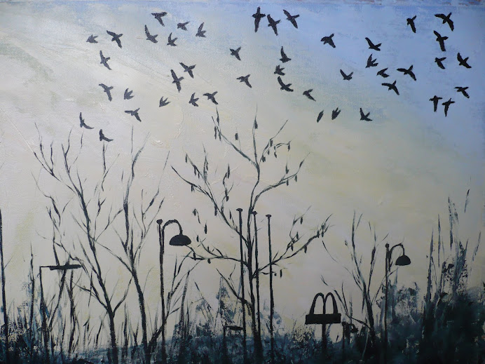
Jackdaws At Dusk

Jackdaws At Dusk
Showing posts with label Combine Painting and Collage. Show all posts

Sunday, 24 October 2010

Paper Mosaic Collage


I'm feeling very honoured to have had comments on a few of my posts here from Ellen Golla herself after having found and joined her own blog site which she then followed the link back to my blog site. In honour of that I thought I'd include photo's of the paper mosaic collage I created inspired by her images.


I created this collage mosaic based on a sketch I did of the light patterns from a lamppost that had grown up into a tree. The image by Ellen Golla that fed into my version was "I'd Drown Looking for You" which I found on her website and did my own sketched version above. It was the flow of mosaic pieces that really caught my eye, along side the contrast of the vibrant and shinning colours in the centre surrounded by the darker shadowy areas. My own version tries to tie in these elements of flow and vibrant colour. The allusion to fire is something that I'm happy with because Ellen herself also uses a lot of fire images in her own work, which makes me wonder if it has symbolic meaning for her.


My comments in the previous post about her work mentioned how labour intensive I found doing this image. I took about four hours to do this small A3 size image, working for an hour each time for four different sessions, most of the time taken up with cutting the pieces. Towards the end of the piece, for the areas down the bottom, I tried to short cut the amount of time spent cutting by folding the paper a few times over and cutting through five or six layers at the same time. The saved on time but ended up with irregular shaped pieces and sometimes picked up on colours in the magazine scraps that weren't quite right. The pieces in the middle of the image were cut individually so it features little detailed pieces that I wanted to include such as the tiny little slice from a cello showing the f shaped sound hole. There's also sections in the darker areas with pieces from birds and animals, because the magazine that I used primarily was the Royal Society for the Protection of Birds magazine, but I quite like their inclusion, as it's a bit like a jigsaw puzzle.


When I featured Ellen Golla's piece "Tea Time With Gordy" a few posts back she was kind enough to comment that she had taken a few months to finish the piece, working on the piece for a little while each day, which is quite amazing. It was also really nice to find out from her that the foreground images, such as the tea set and the swans were indeed taken from photo's she'd taken and placed on top of the mosaic pieces, which is what I'd thought from studying it. Having her feedback has been invaluable and I'm very grateful.

Friday, 8 October 2010

Joseph Cornell


Soapbubble Variant c.1956 Mixed Media. From the Bridgeman Education Site.


Untitled c. 1960 Joseph Cornell. Collage on Masonite Board. From the Bridgeman Education site.


Although for some people the image of a naked woman lying on the grass would catch their attention, for me it's the image of Caerphilly Castle in the background! I'd know that castle anywhere, it's just down the road from me and I've stood underneath that precariously balanced section of wall - a Welsh Leaning Tower of Pizza. Not only is it surreal that a naked woman is outside having a picnic, but to me it's also surreal that an American artist would use an image of a building from Wales.


http://www.aaa.si.edu/collectionsonline/cornjose/
This link is to the papers written and compiled by Joseph Cornell throughout his entire career and it's really interesting. There's twenty five pages of stamps that he collected, as many of his Shadow Boxes included stamps in them. They must have had an important relevance for him. The website says there's twenty five linear feet of papers that the artist collected, either as business correspondence or artistic references. There's also 66 linear feet of artifacts that were directly related to the shadow boxes and collages that he created. Incredible. You could spend hours just on this one site alone, sifting through the reams of information.


He was obviously a man with a finely tuned visual sense, with nature and humans seeming to occupy the majority of his symbology. The image above for Saopbubble Variant refers to the interest he held in celestial affairs. One of the stamps used in the top left hand section, of the little girl, has also been used in another of his shadow boxes, Untitled 1950, which I saw in The Art Book by Phaiden, which just shows how much relevance he attaches to all these different images, and how deeply they've entered his visual language.


This link has a huge list of photos to look at. http://www.ibiblio.org/wm/paint/auth/cornell/

Monday, 20 September 2010

Collage Artist


"The Letter" 1994 Mixed Media. Nissan Engel. From the Bridgeman Education Site.

I've just done a search for "collage" on the Bridgeman site and it's come back with 1042 results, including many from the Dadaists which I will be looking into more detail to come. However the images that caught my eye were all by the Israeli artist Nissan Engel and there were many by him. So for now I just wanted to include this image by him. I love the rich colour and the textures created by the ripped paper. I also love the inclusion of manuscript paper which personally I find exciting because I play piano so I'm always wondering what the pieces sound like, but also the patterns of the black dots and lines adds another level of interest to the textures. I'm planning on experimenting with manuscript paper myself, but I find it hard to contemplate ripping up real manuscript paper so will probably photocopy some sheets and then age them by painting over them or staining them with teabags.

Robert Tilling


http://www.davidsimongallery.com/Artists/Tilling.htm I've just been doing some looking around the Internet for information on Robert Tilling, whose one of the artists with work featured in the course book for the "Collage" project. This was one of the interesting sites I could find on him. It wasn't what I was looking for though, and I was a bit disappointed that there wasn't one mention of him using collage in his paintings. All of the images featured, whilst similar in subject matter to the "Distant Headland" which I first saw in the course book and I've included above from the Bridgeman Education site, are actually completely different in their colour scheme, because "Distant Headland" features very subtle gradations of tone in a monochromatic colour scheme whereas the paintings featured in the websites are very vibrantly coloured.


The website http://www.thisisjersey.co.uk/art/roberttilling/index.html says that he works "primarily in watercolour, acrylic, gouache and charcoal" and another website http://www.mallgalleries.org.uk/index.php?pid=113&subid=220 features an artists statement by him which says that "my work is based on observation and memory, where chance and accident play an important role. I often work very quickly paring down my ideas to abstraction." This site features some very interesting images that are more vertical in their orientation, as opposed to horizontal like the landscapes, and the vivid purples oranges and blues work really well here but area again very different to the painting featured in the course book.


I have to say I much prefer his monochrome "Distant Headland" and will be interested to have a go at mocking up this image in my own logbook just to see what I can learn from his technique. I really like the way he's used heavily textured watercolour paper, which he's painted on top of, then ripped the edges, creating a ragged white line against the mottled greys layered up underneath. These subtle horizontals and diagonals are all that are needed to suggest the bands of the horizon on the coastline.

Friday, 17 September 2010

Ellen Golla


http://zebracrossing.org/ I thought I'd do a link here to Ellen Golla's website. I've written about her in my sketchbook for two different projects, "Animals" and "Collage" and I just love her images and little constructions. The tiny books in little medicine capsules are amazing, how on earth would you make them? The quote by her on the first page is very inspiring, "I love the scent of paper, the textures of paper, and the endless possibilities of paper. My paper mosaic collages are intricately composed of hundreds of little bits of cut paper," and in an image like "Tea Time with Gordy" which I've included above from the Bridgeman Education site, it perfectly shows off each one of these tiny slices of paper, stuck together to suggest the movement of water, rushing the collection of tea set pieces, including a swan in a tea cup, over the edge of the table, like a waterfall, where they will surely crash. There's usually a slightly Surrealist element to her images, such as the swan in a tea cup, or maybe it's just there to show her sense of humour.

I've experimented with her way of working for the project "Collage" and found it to be very labour intensive, and I didn't even cut the pieces as small as she does. In the end I found that combining paper and paint, such as Mike Bernard's method was much more to my liking, but I'm glad that I experimented with a few different ways to find out. From studying this image above I imagine that she used the collage mosaic method for the background but used whole images for the tea set, as they look too perfect and smooth to have been constructed from many small pieces of paper. Her website says that she often uses her own images so I guess that's what she did here and took photo's especially for this composition.

Wednesday, 15 September 2010

Detail of the Final Image


I wanted to take close up photo's of the final painting to show in better detail the textures in the use of paint and paper. I found that they also created interesting images and compositions in their own right, so I've included a few examples here.

The Final Image

I have to say I'm really happy with the success of this image and am pleased with how far it's taken me out of my comfort zone as I'm more accustomed with painting in detail.

This final stage saw me adding splashes of colour to the darker areas in the top right and bottom left hand corner, similar to the splashes of green in the watercolour sketch. This has helped to lift the darker areas whilst also emphasising their tonal differences. When compared to the previous photo the contrast is quite large.

The use of collage as a technique is one that I will definitely use again, as the possibilities are vast especially when used in combination with paint. In my sketchbook I've experimented with more abstract images plus landscape compositions and in a way this final image here is like a cross between the two, there are elements of abstract and natural representation within it.

The one area of weakness that I can see in the final piece is that maybe the composition is slightly too straight forward. The flowers are laid out in two horizontal rows, and maybe there could have been more movement here. I think this fault has come about by not planning enough at the beginning stages, and laying the coloured paper areas out without considering their relation to each other in the composition. Once it got to the stage that I could see there was a slight problem I didn't feel confident enough to be moving the areas around without affecting how it already looked. There is a fine line between chaos and order and maybe the beginning stage was a bit too random, so I will know to plan more in the future. However the dynamism of the paint and collage effects more than makes up for the slightly tame composition, in my opinion.

More Colour

Here I added more colour for the flowers, using both acrylic paint applied with card and small strips of coloured paper. I like the way it's given more definition to the flowers without making them look too cut out and neat. I've also darkened the background, using mostly paint, to add more tonal contrast, something that is very striking in Bernards images. Even though the original watercolour image didn't have this much dark paint it still benefited from the lighter area surround the painting, which this painting doesn't have, so I think that the darker blues and purples in the corners is helping to bring the flowers into greater focus.

I'm also worried that the dark paint is slightly too dark so am contemplating adding lighter areas on top, maybe in the form of dragged paint using the card, as I've done in other areas, but am thinking of splatting paint on top, using white and yellow. The original watercolour featured splattered green paint which crossed over into the pale paper and I think added more interest to the image, so I will see how it looks here.

Detail from collage


This close up image shows the dribbles of paint blending into each other and the contrast between the printed areas of paper and the plain paper used for the collaged sections which I think adds a lot of interest. Taking photo's of the individual areas of flower shows that they are just as dynamic as the full sized image in my opinion.

For the background colours I used gouache paint watered down well because I didn't have acrylic ink as Mike Bernard uses, so I wanted something that would have the luminosity of ink but with more body to it to show up as a slightly more solid colour. I'll be using acrylic paint on top of this layer, plus integrating more coloured paper, and will be applying the paint using pieces of card, as opposed to paint brushes, which is a technique that Bernard uses in his paintings.

Tuesday, 14 September 2010

Colour and Collage


For this stage I layered tissue paper onto the base layer of paper, this was because I wanted more texture for the top layers of paint, so I purposefully crumpled the tissue before blotting it down into the glue. I also planned on applying the paint using Bernard's technique of scraping it on with a strip of card, this would mean that the paint stuck to the top ruffles of tissue but that the bottom layers would stay the original colour. He also uses a lino roller for his paintings which creates the really interesting stipple effect as the paint is dragged across, it would be worth investing in this piece of equipment for future use.

Another technique Bernard uses at this stage is to spray the whole painting with a water sprayer, then dribble acrylic inks into the water so they create random patterns in the paper, sometimes angling the board at a different angle to how it will be seen in it's finished state. I don't have a water sprayer so instead I painted a layer of water over the whole image, then added areas of coloured ink, and finally dabbed large splodges of water at the top of the board so that it would take some of the ink with it as it ran down the paper.

At this stage I also added sections of green paper and card, these are the areas with the sections of print visible, and this visible text is a common feature of Bernards work and helps bring a lot of sparkle into the image. The tissue paper has also been used to integrate into the daffodil flower section, then I painted yellow ink into these areas and I like the way that the green ink has run into it and bled.

Project "Combine Painting and Collage"


My main source of information on technique and ideas for creating collage images is the book by Mike Barnard called "Collage, Colour and Texture in Painting." I'd seen it listed in Cardiff Library when I did a search for "Collage" so I put a reserve on it and was pleased when my tutor also recommended to me.


One of the most interesting things about the book is Barnard's advocation for starting a painting by laying down a random pattern of paper and textures, this is to fuel his creative thinking and to break down any feelings of preciousness about the image, so that he can be as free as possible. He then layers washes of acrylic ink, letting then blend, bleed and dribble down the image. Once this is dried on top of this is laid more washes of acrylic paint, some thicker and mostly applied with sections of card or a lino roller, then more coloured paper is added for greater definition.


Using his working method as my starting point I decided to follow this example to create my own collaged mixed media image. I used a watercolour sketch of some daffodils from my sketchbook form the last course I did as the image to base my painting on. I liked the sketch because it was colourful and textural and also there was a simplified use of foreground and background, all useful features for creating the collage. I applied random strips and chunks of paper, tissue and card to the thick backing paper, using torn pieces of yellow paper, in two different tones, to suggest the forms of the flowers. I left the background a neutral colour because I wanted to add the blues and greens with the acrylic paints, plus maybe the addition of further coloured paper. I purposefully left it quite open at this stage and didn't do any further sketches in my sketchbook because I wanted it to evolve in a very natural way.