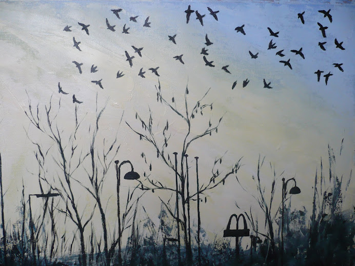
Jackdaws At Dusk

Jackdaws At Dusk

Tuesday, 19 April 2011

Dragging the Paint

I'd done numerous studies in my sketchbook, in oils and acrylics, to experiment with the technique of dragging the paint, but nothing quite prepared me for using the plastering tool on such a big scale. Not even Elfyn Lewis' paintings are as big as the version I did.


This first photo shows the very first swipe that I did. You can see how the blue starts to bleed into the white, which I wanted to happen, but you can also see how there's not enough blue to cover the whole of the canvas. Looking back at the previous photo, on the previous post, I can see that I applied no where near enough paint to cover an A1 image. But hindsight is a wonderful thing. What I ended up having to do was apply more blue paint as I was going along, but this resulted in patchy areas of paint, where they weren't mixed

in well with the rest of the paint, this can be seen on the edges of the final painting.


This second photo shows the middle section after a few most swipes, and it's interesting as it's shows how all the different tones of blue start to flicker when mixed with the white paint. In the final image this results in an almost neon glow which I hadn't anticipated and which I'm really pleased with.


Preparing to Paint.

This first photo shows the layers of acrylic I'd applied, leaving each one to dry before adding another. They were applied rather thinly, mixed with a bit of water, as I wanted to keep the canvas as smooth as possible in order to not have any lumps that would snag the plastering tool when dragging the oils across the canvas in the last stage.


At the final moment I decided to add a layer of black paint on top of all these colours because I felt that I wanted to preserve the purity of the blue oil paints that would be the top layer. I felt that the mixture or reds and greens would be a distraction and not a complimentary element. I'm glad I painted so many layers of acrylic in the first place as it's given such stability to the painting, and depth of colour that wouldn't have been so effective if I had layered only black paint underneath.

This second photo shows the oil paints laid out on the canvas ready to be dragged across. The four horizontal stripes are the four different coloured blues that I used; french ultramarine, pthalo blue, windsor blue and pthalo turquoise. The white was for the stripe cutting through the middle of these blues. You can see the black paint underneath, still showing glimmers of other colours such as the reds and blues, but I'm now glad in hindsight that I made it this dark.

Preparing the canvas for the Minimalist Seascape

Having also studied the work of Mark Rothko, who was linked with Barnett Newman and the Abstract Expressionists, I'd noticed the layering of coloured paints that Rothko used. Newman's work had much cleaner lines and a thicker, less transparent layering of paint, possibly applied with a roller as it looks so smooth. Rothko's was more likely applied with a large brush, ground and rubbed into the canvas to create areas where the base coat of paint was allowed to glimmer through, affecting the colour that was applied on top, either making is darker or lighter.

After experimenting in my sketchbook with the different versions of the composition and technique that I was going to use for the final painting, I decided that I needed to introduce colour into the ground for my painting. So I layered black, green, red and blue acrylics. This was also in order to make the oils on top richer and and more glossy, so creating a thick luminous sheet of paint, imitating the sheen of water.


This photo was taken before I'd applied any paint, apart from a base coat of emulsion, and it shows the support that I'd stuck the canvas to in order to keep it completely flat, and it also shows the builders plastering tool that I was going to use to scrape the paint across. I didn't want to stretch the canvas onto a wooden frame because the fabric would have sunk in the middle when dragging the plastering tool across it, and there would have been lines on the edges where the wooden beams underneath would have touched the canvas with the force of pressing down. So the best alternative I could think of was to measure it up based on the biggest wooden stretchers I have, so that it could be stretched at a later date, and to tape it all in place, masking off the areas that I didn't want paint on, which corresponded with the edges of the wooden frame.

Monday, 21 March 2011

Barnett Newman and Franz Kline


Uriel, 1955, by Franz Kline and Zinc Door, 1961, by Barnett Newman at the Kunsthalle, Hamburg, Germany. Photo courtesy of Bridgeman Education.


Reading the book Abstract Art by Mel Gooding I became interested in the work of Barnett Newman, which seemed to have such an immense scale and an interesting use of splitting the canvas up unto smaller strips, which were called "zips." Seeing them in a book is very different to seeing the real thing, and this photo form the Bridgeman site gives a good idea of the scale of the painting. It's dimensions are 243.8 by 548.6cm which is impossible to visualise from the close up photo of it which is also on the Bridgeman site.


Uriel By Barnett Newman, photo courtesy of the Bridgeman Site.


However this detailed photo does give more information about the colour and construction of the painting, again showing zips on the side, though instead of the standard one zip in most of his other paintings, this time there are five; two black, town white and one blue.


This painting stood out for me as an abstracted view of the ocean and shoreline, even seen with the lines vertical it seems to shine with light and water. Viewed on its side, so the stripes are horizontal, creates an even more convincing illusion of the sea. This also fed into my interpretation of a Minimalist Seascape.

Tuesday, 15 March 2011

Paint a Minimalist Seascape

http://www.oriel.org.uk/Gallery/Gallery-ARTISTS/Profiles/Portfolio/Lewis.aspx#/CMSPages/GetFile.aspx?guid=e30aec5a-73bd-4fed-a4c1-03a8cc9eb395

I've decided to do the Minimalist Seascape project for this part of the course. I was drawn to it at the thought of booking the day off from the children to go and draw by the beach. But reading the coursebook I realised that representing the view isn't the primary aim of this project. So I filled pages of my sketchbook with images based on splitting the rectangle into different shaded sections.
The colours and the application of paint came next and this is where Elfyn Lewis' work came into play. I copied a few of him images in my sketchbook and even tried to emulate the way he drags the paint across with the scrapers and squeegies that he uses. But there's nothing like the real thing, and this link above shows a selection of his actual work in a recent exhibition.
The third painting down (or third on the right of the small boxes on the bottom of the page) is called Moel Y Mor which is welsh for mound of the sea. Admittedly the painting doesn't look much like a mound or the sea but it has really intriguing use of paint and a solid sense of movement because of the way the paint has been dragged, so the allusions to water are there in an abstract way. The tonal contrast also really draws my to it and I see it as a valid beginning to experimenting with the Minimalist Seascape.

Wednesday, 2 March 2011

Working on The Finished Painting


I added another layer of thin oils here, using Sansodor, a low odour thinner by Windsor and Newton, rather than turps.

The hand is looking a bit odd because it wasn't added in the original charcoal drawing on the canvas, so is a different colour to the skin on the face, plus the shape and size is wrong in composition to the head and body.

I added more layers of charcoal on top of the original layer of oil as I wanted it to mix in and accentuate the texture form the canvas.


More detail was added to the face, hair and hand. I wasn't able to change the proportions of the hand because it was already close to the edge of the canvas, plus the angle of the arm couldn't be changed any more because it was already bent quite far in. So I ended up making the head smaller which has made it look more in proportion to the body and hand.


I painted the detail for the eye, nose and ear quite quickly with thinned down paint. The ear was just a few squiggles, painted from memory, and I'm pleased with how much it looks like a ear. The contour and shadows on the face also work really well.


Keeping the bottom part of the painting loose and thin was important for me, having seen and studied the work of Augustus John and Eugene Carriere. The charcaol was left quite conspicuous here, which acts as a contrast to the detail in the top half of the figure.


Tuesday, 1 March 2011

Oils on the Portrait

This is the first layer of paint, not that I'm planning on adding many more layers as I want to keep it thin and translucent like the work of Augustus John and Eugene Carriere. I purposefully didn't prime the canvas, just sized it with a layer of slightly watered down PVA glue. I did this for a few reasons.
Firstly I wanted to keep the texture from the canvas grain (it's heavy weight canvas with two threads woven in each direction) as this adds flickr to the texture of the paint, a bit like the texture of watercolour paper, where the paint doesn't sink into every part of the paper.
Secondly I wanted the more natural colour of the canvas to show through, as opposed to the clinical looking white primed canvas. I thought this would add to the skin tones, and also I've been inspired by the work of Augustus John who purposefully didn't paint every single part of the canvas or board, which I find interesting.
Thirdly, inspired by the later paintings of Gwen John, I wanted a dry matt finish for the paint, as opposed to glossy and shiny. There is a painting by hers called Girl in Profile which I'm slightly obsessed by. It's on display in the Museum on Cardiff and the texture and dryness of the paint fascinates me. Finding out from information in the Museum that she created her own chalky ground to paint on, which absorbed the oils from the paint, was really interesting.