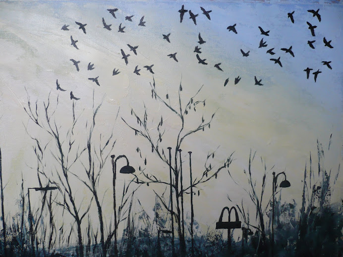
Jackdaws At Dusk

Jackdaws At Dusk

Monday, 19 July 2010

Adding detail


I was happy with the sky in the previous image, but then realised that in the John Piper skies there's more swirling movement and so I decided that I needed to add more movement to my painting, as my previous stage had more of a cross hatching type texture to it. The sky still needs a bit of work doing to it but I'm happy with how the lighter area in the middle of the sky creates the light source for the building. There's much use of this kind of dramatic skyline in the backgrounds that Piper painted for theatrical productions.

I've started to mix darker colours into the building whilst the paint is still wet as I decided not to leave it all until the paint had dried just in case it looked too rough.

To help my assessment of the composition I've added the main elements such as the gravestones and the dry stone wall and also the windows so that I could judge if I'd got the proportions right. It's frustrating trying to add darker detail to the window when the lighter paint just mixes in and prevents the dark from sticking, so there are some issues that will have to be resolved when the oils have dried.

I've noticed how fond Piper is of black within his paintings and I'm hoping that it's not pure black from a tube as I've been warned against that so many times! So to incorporate darker colours into my painting (which I've already started to in the trees in the side) I've been mixing viridian green with prussian blue and a tiny bit of payne's grey and sometimes some burnt sienna to warm it up a bit. I'm hoping that this will provide the added layer of depth that's in Piper's paintings without killing the colour and sucking all light out of it.

Adding the oil paints


This shows the first layer of oil paint added to the base coat of acrylic shown previously. The thick layering of dried acrylic chunks is still visible and provides an interesting relief to the flat layer of the canvas. The light sourse for this photo is from above and shows the texture off very effectively.

My colour scheme here is based on several paintings by John Piper, which I've included in my sketchbook studies, as he was quite distinctive in his use of striking blue for the sky, with the dark swirling clouds, coupled with yellow ochre used for the building. At such an early stage the building itself is still looking very neat and clean, though this will be adapted as the oil paints dry and I'm then able to scumble and mix in darker colours into the base coat.

The background here is still very dark, though detail will be added, notably in the foreground for the gravestones. I'm unsure wheather to bring the trees on the sides into their full colour range or keep them as shadows to frame the building. At the moment I'm quite happy with how dark they look. There's also a dry stone wall that's right in the forground and I'm looking forward to utilising the dried acrylic relief here to recreate the effect of rough stone.

Project 7; Paint In The Style Of Another Artist


John Piper has interested me since the Autumn project for the course "Relating to Other Artists" and I've continued to do research into his work. Seeing one of his paintings on display in the National Museum of Wales in Cardiff recently was interesting in order to see how he used texture and layering to achieve his dramatic effects. I've also been reading the book "Lives in Art" by Frances Spalding which chronicles the lives of husband and wife team John and Myfanwy Piper. The book goes into quite a bit of detail behind the techniques that John used, especially the use of thick gesso paint in the background and also the way he would scrape into the paint. The website johnpiper.org.uk gives information that John wouldn't actually have painted the oil paintings outside, as he felt the equipment needed to create these paintings was just too cumbersome, but he did many watercolour paintings on site and would accompany this with pages and pages of written information on tonal properties and colours.

Using this information and the images featured in the book and the website I decided to create my own John Piperesque painting for the project "In the style of...", using as my subject matter a chapel which burned down a few years ago. I'd painted the chapel in its whole state for the Watercolour course five years ago so I found the idea of treating it in a different style to be interesting and challenging.

I spent many pages researching and recreating images by John Piper incorporating his dramatic colour schemes, then went on to experiment with my compositions for the chapel using different viewpoints, and then proceeded to start the final painting. I wanted to use oils, as John would have done, but felt that painting with acrylics as an undercoat would allow me greater flexibility with time seeing as thick layers of oil paint would be used and I couldn't wait too long before posting it off to my tutor.

Whilst laying down the initial layer of acrylic paint, using an old palette with dried on paint, I came up with the idea that rather than scraping off the old acrylic from the palette and throwing it in the bin, I would use it to thicken up the background for the painting, which would then create the opportunity for interesting paint textures for the oils on top. The two photo's above show the end result of the base layer of acrylic, incorporating the thick dried chunks of acrylic. At this moment in time I'm still unsure if it's going to work though, I'll either live to regret it or decide that it was well worth it. For now I see it as an interesting effect and I'm willing to give it a go.

Thursday, 1 July 2010

Old and new version of the "Moving Figures" project


Following advice from my tutor and my own opinion that the original painting for "Figures in an Interior," which is shown in the top photo, was just too vague and not detailed enough, I decided to rework the image. I went back to my original sketches and the original idea to base it on similar techniques and style to the sketches by Henry Moore in his "Shelter Sketchbook", and the result is the drastically different painting in the photo on the bottom.


I'm so glad that I've changed the first painting, and it's made even more apparent the weaknesses in that painting by seeing it here next to the new one. The main problems in the old version are the lack of depth to the pictorial plane and the deadening of the colour by the use of too much black. The application of paint, which was meant to be expressive and gestural, just ends up looking messy and vague.


My tutor pointed out to me the level of detailing that can be achieved whilst still keeping a feeling of movement and freshness, by showing me the work of the OCA tutor Colin Allbrock. This really helped me decided on the amount of detailing that I wanted to add to the new painting.


Another major difference between the paintings, which I'm really glad about, is the use of light and shade within the composition as a whole, not just the light and shade in the figures, but the fact that the top half of the new painting is much lighter than the bottom half, strengthening the illusion of the light casting source of the coloured lights, bringing them into more prominence as opposed to the original painting where they weren't really contributing anything. It also adds a feeling of depth and movement that the blackness in the original painting just couldn't create.


On a personal level I'm glad I stuck to my original idea of including the unusual "harp guitar" instrument which was played by the guitarists, because in the first painting I thought it might look too strange, but now that it's been added it's the normal guitar which looks strange because of the ineffective colours used.


I'll do a full write up in my logbook for "what I have achieved", but what I wanted to show here was a direct comparison between the two paintings.

Tuesday, 29 June 2010

Henry Moore at the Tate

I know this is such a touristy thing to do, but it had to be done! This is me next to one of the Henry Moore sculptures that I saw when I went to the Tate at the end of May for the contextual studies workshop with Richard Lilley where we discussed and sketched lot of the paintings from the modern British art collection, I've written all about it in my logbook. I also went to the Henry Moore exhibition which was downstairs, and I've written about it in my logbook too because his sketches in particular were a source of inspiration to me, especially in the "Figures in an Interior" project.


I love his sculptures too though, and this figure stopped me in my tracks when I walked in to the building. She was so tender and monumental at the same time, a bit like a whale, if you know what I mean. I've read the book "Celebrating Moore" which has so many photo's of his work in it that it makes you giddy. I'd love to see some more, especially the ones that are outside like on big hillsides. I've been to the Barbara Hepworth Museum down in St Ives, and her work looks so wonderful when it's outside, which a lot of it is as it's arranged in her garden as she wanted it to, and the sculptures look like they're growing out of the soil, which I can imagine Moore's work being like when viewed outside.


Movement Experiment

This is the final image for another exercise for movement which I wrote about in my first sketchbook on page 69, but I wanted to include here to show it along side the previous movement painting of the swimming pool because of its similar flickering effect, thought here it was achieved through different means, which were suggested in the course book. It said to try cutting up a photograph or a drawing into thin strips and glue them down with thin areas of white showing in between. I took the idea a step further and took three separate paintings, all of kites which were painted from photo's that I took on holiday, then I cut these into strips and glued them down with the three separate images layed down in an alternate pattern. I'm really pleased with the effect this has given, again like the last painting, as though it's seen through a prism. It does make it look like the kite is moving and that the tail is flickering around. A very interesting effect and a worth while experiment. I also love how simple the image is, especially the colouring, which was inspired by the David Hockney painting "A Bigger Splash" with its pristine blue water and sky, and how such a flat slab of colour could still help to convey movement, maybe because it acts as such a strong counterpoint to the movement of the splash in the water, and here the kite in the sky.

Finishing off the Figure

Having completed the background in the previous stage, all that was left was to add the detail for the figure. I started off by redefining the highlights where the sun was hitting the limbs and torso, then added shade to the opposite side. Closer study of the photo showed me areas from the body that were being refracted by the water, and it's interesting to see how much of a difference it's made to the implied movement of the figure that there are areas around the arm on the right and the head and legs that have been split up like a prism, and the water has overlapped into the areas of the body.

I added more splashes, with a purer white, instead of the bluey white used previously, to the area at the bottom which has again contributed to the feeling of movement through the water because the splash is further away than the foot, suggesting the figure has already moved away from where she was.

I'm really happy with the image, and feel that it conveys movement very well, both of the water and of the figure. I'm also really happy with the level of realistic detail in it, but also how expressive it is as a painting with lots of gestural brushstrokes.