 This is the final image for another exercise for movement which I wrote about in my first sketchbook on page 69, but I wanted to include here to show it along side the previous movement painting of the swimming pool because of its similar flickering effect, thought here it was achieved through different means, which were suggested in the course book. It said to try cutting up a photograph or a drawing into thin strips and glue them down with thin areas of white showing in between. I took the idea a step further and took three separate paintings, all of kites which were painted from photo's that I took on holiday, then I cut these into strips and glued them down with the three separate images layed down in an alternate pattern. I'm really pleased with the effect this has given, again like the last painting, as though it's seen through a prism. It does make it look like the kite is moving and that the tail is flickering around. A very interesting effect and a worth while experiment. I also love how simple the image is, especially the colouring, which was inspired by the David Hockney painting "A Bigger Splash" with its pristine blue water and sky, and how such a flat slab of colour could still help to convey movement, maybe because it acts as such a strong counterpoint to the movement of the splash in the water, and here the kite in the sky.
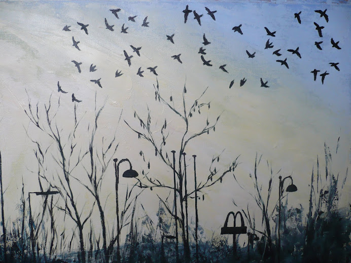
Jackdaws At Dusk
Tuesday, 29 June 2010
Movement Experiment
This is the final image for another exercise for movement which I wrote about in my first sketchbook on page 69, but I wanted to include here to show it along side the previous movement painting of the swimming pool because of its similar flickering effect, thought here it was achieved through different means, which were suggested in the course book. It said to try cutting up a photograph or a drawing into thin strips and glue them down with thin areas of white showing in between. I took the idea a step further and took three separate paintings, all of kites which were painted from photo's that I took on holiday, then I cut these into strips and glued them down with the three separate images layed down in an alternate pattern. I'm really pleased with the effect this has given, again like the last painting, as though it's seen through a prism. It does make it look like the kite is moving and that the tail is flickering around. A very interesting effect and a worth while experiment. I also love how simple the image is, especially the colouring, which was inspired by the David Hockney painting "A Bigger Splash" with its pristine blue water and sky, and how such a flat slab of colour could still help to convey movement, maybe because it acts as such a strong counterpoint to the movement of the splash in the water, and here the kite in the sky.
Finishing off the Figure
 Having completed the background in the previous stage, all that was left was to add the detail for the figure. I started off by redefining the highlights where the sun was hitting the limbs and torso, then added shade to the opposite side. Closer study of the photo showed me areas from the body that were being refracted by the water, and it's interesting to see how much of a difference it's made to the implied movement of the figure that there are areas around the arm on the right and the head and legs that have been split up like a prism, and the water has overlapped into the areas of the body.
 I added more splashes, with a purer white, instead of the bluey white used previously, to the area at the bottom which has again contributed to the feeling of movement through the water because the splash is further away than the foot, suggesting the figure has already moved away from where she was.
I'm really happy with the image, and feel that it conveys movement very well, both of the water and of the figure. I'm also really happy with the level of realistic detail in it, but also how expressive it is as a painting with lots of gestural brushstrokes.
Monday, 28 June 2010
Ripples and Splashes
 The effect of the water rippling is really starting to come together now, and the illusion of depth is quite convicing. Closer study of the original photo, which had previously been studied at arms length, as it was attached to the board, showed how much more detail there was to be found in the image, especially subtle, tiny ripples and reflections. This has added a lot more interest.
 I used a softer sable mix brush for this stage, after having used a hogs hair brush up til this point, and started off with the larger brush to add the larger areas of reflections in the top of the painting, then a much smaller sable brush to add the tiny ripples of light on top of these larger areas. The section on the bottom right of the painting has particularly benefited from the extra ripples added there, because the detail in the top area of the painting was too dominant. The large splash at the bottom is also helping to equalize the interest in the different sections of the painting.
I've also added more definition to the figure, with more light and shade to suggest the contour of the limbs, though this is by no means finished, as it needs to be defined more clearly before it is then broken up by the refractions of the water.
Adding Detail
 It's quite hard with this painting to see very much development, because all of the elements are already there. What I'm aiming to do is to tighten up the amount of detail that is there. I also want to add more depth, which will be achieved by adding a greater contrast between the light and dark areas. Looking at the original photo shows a lot more sparkle in the water, and the area at the bottom of the image is where the splash is taking place from the foot kicking up, so I will be using splatters and splashes to achieve the effect. This will be an interesting contrast between the area in the top left hand corner which shows the bigger ripples.
I've also added detail to the figure here, just to better place it in its context, and the addition of the goggles is quite and interesting feature, as it makes it look quite eery.
New Movement Painting
 Following a recent holiday in Devon, where I unfortunately forgot to take my sketching equipment, I took lots of interesting photos which I was hoping would provide me with lots of images to incorporate into the "Movement" project. A wonderful set of photo's I took was of my children swimming in the outdoor pool, on a gloriously sunny day, which gave loads of ripples and reflections. My daughter was the most willing model for me, as being older than her brother she can swim under the water. So I was getting her to swim around so I could photograph her. What made this such a novelty for me is that where I live we are forbidden to take photo's of our own children in the local swimming pools.
 There was one photo in particular which I took of her, that really caught my interest, where she fully submerged but looking up at the sky. This photo here is the beginning of my painting of it. I started off with a layer of ultramarine blue, but when I saw that the colour didn't match up with the turquoise of the water, and not even adding white made any difference, I decided to invest in a new shade of blue. A visit to the art shop helped me decide on Cerulean Blue Hue, which when mixed with pale green, ultramarine and white, like I've done here, has perfectly captured the rippling sun dappled effect of the water.
I roughly filled in the area of the figure, just so I could see it in its position, but I'm not being too precious about painting over it in areas, because there are areas on the legs, arms and head which are fragmented by the water, so this will help to give that effect. When I first started blocking in the areas of paint for the figure and the water I did my brush strokes going horizontally, but I realised that this deadened the image, and made it look flat and motionless. Changing the brushstrokes to diagonals, as shown above, has created greater movement, and made the effect of the sun and water rippling much more effective.
I'm again using acrylics here so I can layer the paint quicker than oils. I did think about using oil paints, but I was worried about how much smudging would occur between the paint. However I am planning on copying another one of the swimming photo's, this time of my son, for my own use (as it does not convey movement as effectively as this image) and I will try and use oils for this version, then I can compare the effects of both images.
Finished Painting

The finished painting converys a lot of the movement that I was hoping it would, both in the rippling of the fields in the rise and fall and the suggested movement of the wind from the growth pattern of the trees. The texture of the paint had a lot to do with the flow of the grass and the leaves, which is what conveys this movement so well. Working from the studies from home, after doing the preliminary work on site, was interesting because of the challenge it offered, and also the scope for developing the image beyond what was presented in front of you when sat looking at the hill.
If I had to do it again I would develop more detail in the main tree, because it does look slightly blob-like, also looking at the photo of it now I can see how the two areas of sunlit grass, on the left and the right, don't match up colour wise, the area on the right looks slightly more blue compared to the greeny yellow area on the left, but as the painting is quite large I didn't notice this at the time.
I'm glad I used acrylics, because the faster drying time enabled me to apply many more layers than I would have been able to achieve with oils. Having said that, I've never actually painted on site with oils, so that would be an experiance worth having. I know that project 12 offers another landscape painting, so maybe that will be my opportunity to experiment with it. I think I will invest in the seperators you can get, that enable you to layer the board you paint on to another board which prevents the oils from getting smudged in transport.
Sunday, 27 June 2010
Adding the Tree
 Adding the tree now as the main focal area has made such a difference to the composition, making it seem like a complete image. The way that the tree grows up to the left after having been pushed by the wind for so many years, is an interesting feature, as it mimics the flow of the land. The focus of the painting now is no longer just the rippling effect of the hill, but is also the implied movement of the wind. There's still a lot more detail to be added at this stage, both to the existing trees and to the trees which will be added to the left and right hand side, at the edges of the composition.
 The photo here is not so good at picking out the subtle textural detail, but there are areas in the sky and grass which have benefited from the thick treatment of paint with the painting knife, even though I'd carried on using the hogs hair brush, because it's created ridges in the paint, which enabled me to create light and shade, and layers of depth, that to my eye suggested subtle clouds and the movement of grass. This is very interesting as it's not something that I'd planned, but is something that evolved as the painting progressed. It's an effect that I will remember for future use.
Subscribe to:
Posts (Atom)