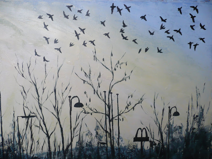
Jackdaws At Dusk

Jackdaws At Dusk

Sunday, 27 June 2010

Changing the composition

The previous image was starting to make me feel uncomfortable with how much space the hill was occupying compared to the sky, and still the shadows looked too dark. So I decided to go back to the studies I'd done in the sketchbook, which had been produced as the sun was rising, so there were three different images with three different shadow patterns, and I decided to work with the latter of the images, which had the greater area of sunlit grass, but still showed the shadows created by the contours in the mountain.

Lowering the line of the hill caused problems because I'd used such thick paint for the hill side, it was now showing as unwanted textured areas in the sky, which you can just about make out in the photo here. I spent a while adding more paint to the rough area of the sky to try and blend it in with the smooth ares, and even though it took quite a few applications of paint it worked out quite well and is now almost imperceptable.

The lighter areas of the grass are now much more successful and not so oppressive, and I really like the way that using the brush (my new hogs hair brush!) to paint on top of the darker areas has created a really interesting effect, one that I wanted to keep and utilise, as to me it suggested the blowing of the wind and the rippling of the grass.


Developing the "Movement" painting


This image shows the work that was done in the house to try and soften the edges of the shadows. I worked this time with a paint brush, as opposed to the painting knife, as I wanted to give it a blurred effect, and to work the wet paint into each other. I also made the effort to lighten the shadows because the contrast between the light and dark areas looked too harsh. The illusion of dips and rises is now starting to look more effective.

I've painted this mountain before for the "Relating to Other Artists" course where we were asked to paint a "Composition of Greens" towards the end of the course. I also worked on site for that painting, and developed studies to work from in my sketchbook. But the composition then was quite different because we were asked to paint different shades of green, so I decided to include another hill into the composition, which is seen to the right of this hill, and is covered in deciduous trees. The contrast between the bright green of this hill, which was seen in direct sunlight at the time, and the darker bluey green of the other hill was quite effective. I also worked with a painting knife predominantly for that painting, using a brush for a small amount of detail, and my inspiration for the image was the work fo Kyffin Williams who was a great Welsh Landscape artist who also painted using a painting knife.

Project 4; Movement


I'd struggled for a while to come up with an image I was happy with for the "movement" project, and my sketchbook has many of my efforts at trying to find a satisfactory image. But the image that kept getting stuck in my head was "Cataract 3" by Bridget Riley that I saw on the cover of "Art and Illusion" by EH Gombrich. The rolling effect of the image was fascinating, and every morning I could see the same rolling effect on the hills visible from my kitchen window, caused by the rising sun casting long shadows in the dips and rises in the side of the hill.

I decided to make the effort to capture this effect, so early one morning I got up and out of the house, with my car packed with painting supplies (and my flask of tea!) and I settled myself down to paint the effects of the rising of the sun. I also made three studies of the light and shade effects and the colours for my sketchbook so I could refer to them later, when finishing the painting off in the house.

The photo here is of the layer of paint that was layed down on site. I applied it very thickly with a painting knife, and used acrylics for their faster drying time. The shadows here are very dark, and also there is a very abrupt edge between the light and shade, but I aimed to soften this effect with further work on the painting.

Thursday, 20 May 2010

Gwen John Paintings

Went to see the Gwen John paintings today in the National Museum of Wales, Cardiff, and was very impressed, nourished and inspired by what I saw there. I made sketches of the paintings, plus bought postcards that will be going in my logbook with a full write up on what I saw and thought of the paintings, but for now I'll just say there were stunning, ethereal, elegant and deeply dignified. You could smell the Parisian air in the paintings of her room in Paris.

I was really pleased when I said to the curator, who took me into the vaults where the oil paintings were stored, that a painting by John of a still life on the table, though seen from a distance, reminded me of the still lives by Morandi, because of the quiet dignity in them, and the hazy way of painting, and she said she'd often thought that about the similarity between the two artists, especially as they were both quite obsessive about their specific subject matters, painting them over and over again. It pleased me that I'd made an observation about her work that a professional curator agreed with - and I've never read in any book about this similarity in style!

I also bought a long handled hogs hair brush from the art shop in Cardiff, ready to do some textural, expressive oil paintings ala Lucian Freud - though maybe not of nude people yet! I've got another book on Lucian Freud to read called "The artist at work" plus one of Gwen John. So for now I will go and do some reading.

Thursday, 13 May 2010

Viewing Gwen John Paintings

I've just had a phone call from the National Museum of Wales in Cardiff, returning my call, to say I can go next Thursday, a week today, to see the oil paintings by Gwen John that are in storage at the museum. There are none out on display at the moment, but the fact that I can go to view her work privately more than makes up for that fact. I want to go to see them because I've read about the unusual way she used oil paints, as apparently they were quite dry, that she drained the oil away from them before applying them, so I'd like to see this for myself. I also want to study her brushstrokes as the paintings always seem almost blurred, as though seen through tissue, so I'd like to figure out how this was done. I'll be able to take drawing materials to the visit, no paints, so I'll make sure to fill plenty of pages for my logbook studies.
When I was in the process of doing the recent figure painting of the girls I noticed how much of a difference it made to hold the brush loosely, and to paint in small side to side motions, especially with the longer handled brush, so I'm wondering if this is something that Gwen John did too. It helped to give it a kind of fluffy edge to the images in the painting, giving them a much more realistic and tactile appearance, so that it wasn't crisp and clean and plastic looking. I will experiment more with this technique, and will invest in a hogs hair brush, long handled, ready to try with oil paints, for any future figure work, like Lucian Freud uses, and I'll also try it to see how it works with non figure based images. The next project is the "movement" project which sounds interesting as it could be interpreted in so many different ways. But before that I still have theoretical studies work to finish for the figures projects.

Wednesday, 12 May 2010

"Patrick Heron" by Michael McNay. Tate Publishing 2002

Having previously never understood Patrick Heron's colourful pictures, I've now fallen in love with them after having seen a large painting by him down in the Tate St Ives. It filled my vision with colour, texture and movement. Since then I've tried to find out more about him and how he worked, so I enjoyed this book about him by Michael McNay and I'll include some passages here that caught my interest.

This first passage is in Heron's own words, about his work, which he wrote about in the essay "Art is Autonomous" written in 1955 and is quoted in the book on page 51. "The meaning which a work of art has for society is not the same as the meaning that the artist was conscious of putting into it. This is because art is not just a telephone exchange which facilitates straightforward communication. The work of art is in some profound sense an independent, live entity. It has its own life. It draws nourishment from its creator that he was totally unaware of having put into it: and it redistributes nourishment to the spectator (including the artist himself, for he is merely a spectator once the work is completed)"
Later, on page 52 he goes on to describe the process of building up a painting using shapes and brushstrokes, almost abstract in a way, that goes into an object, that the viewer knows is an illusion, echoing the work of EH Gombrich in his book "Art and Illusion", but like the greatest magic tricks, we love to be deceived by. He gave this lecture at the University of Texas in 1979. "Even in the most highly figurative of masterpieces the painter knows that it is not Rembrandt's mothers nose he is looking at, but a miraculously ordered mosaic of interleaved, overlapped, opaque, transparent, soft-edged, sharp-edged, rounded or squared, separate brush-touches....A painting's greatness, or otherwise, doesn't depend on that information about the nostril (or about any other of the myriad subjects available): it depends upon the organisational significance, harmony, architectonic coherence - or whatever else you like to call it that those paint marks across that flat surface evoke."
During this trip to Texas he became very ill with pneumonia, and his wife died shortly afterwards. For a while he didn't paint at all, then he started to draw, using a very minimalist, representational style that he'd previously experimented with in 1954. This minimalist style of drawing later found its way into his paintings of the 1990s. The book describes this on page 64 in a very interesting way; "And the whites in Heron's drawings, that pregnant emptiness full of suggested light and colour, seem to look forward to the white expanses of primed canvas he would leave on his final paintings, between the carefree filigree of the scribbled lines of paint."
In an essay on Constable by Heron, entitled "Constable: Spatial Colour in the Drawings" written in 1994, Heron goes into more detail about the illusionistic impression of depth that is created in drawings which is mentioned on page 64; "at every stage in our contemplation of a drawing we are measuring the various depths to which our eyes sink into the illusionistic space the drawing evokes: thirty yards to that tree - seventy yards to that bank, two hundred yards to that hedge - eight-five yards to that gable-end - five miles to that cloud - stop; stop; stop; the eye plunges straight ahead through the illusionistic space of the drawing, down a hundred lines of vision to a 'stop'."
It is not surprising that Heron's primary consideration in his paintings was colour. On page 65 the book mentions that "Patrick equated the spiritual with the continent of colour, better than sex, he said, better than anything as a matter of fact. 'All colour is shape and all shape is colour' he wrote. 'There is no shape that is not conveyed to you by colour, and there is no colour that can present itself to you without involving shape." This suggests that he had a language of shapes and colours that was very personal to him, like a code.
On page 67 it mentions that to the younger generation of artists "Heron was a link with the masters, particularly Braque and Matisse in France; and like Heron, like Matisse's British contemporary Matthew Smith, had not painted out of a sense of inferiority but had set out to learn from the old masters of modernism and match them."
Along side this love of colour was a belief which he had written about many times, "that he believed that figuration would return to painting in a different form," but that "finding parallels in nature was not what Heron meant when he had remarked that figuration would return." He died in 1999, the day after he'd created a series of drawings, based on the map of Australia, that were to be turned into etchings. He was 79 years old, and had pursued the puzzle, the joy and struggle of art until his death.
The Final Painting of Figures in an Interior


This is now the final painting with all the major compositional aspects added. I might alter one or two things, such as the strip of white light behind the two figures which needs to be brighter. Plus there needs to be a bit more detail which I'd like to add to the folded piece of paper on the table, which was made out of lined paper, so I wanted to add very faint lines to show this. Plus the left hands figures left arm still needs altering.

The extra details of shading on the right hand figure adds to a greater feel of three dimensionality to the painting. I'm very happy with the level of detail and realism I've been able to achieve in this painting, the most realistic one I've done so far. I wanted this painting to show that I really could paint and draw, with good observational skills, and I feel I've achieved that. I have to thank the book "Art and Illusion" by EH Gombrich for helping me to interpret what I see and how to translate that to the canvas or paper, by understanding visual language. I've only just started the book and it's taught me so much, so I look forward to more information it can give me with my painting work, both realistic and expressive.

I'll do a full write up on "What I have achieved" for my logbook, but for now I'm happy that it's finished.