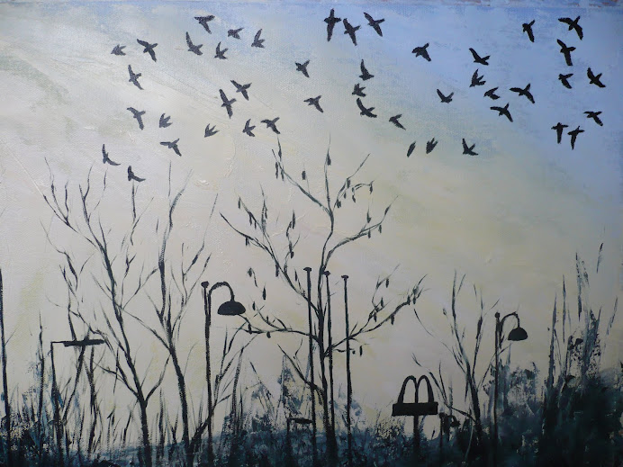
Jackdaws At Dusk

Jackdaws At Dusk

Sunday, 9 May 2010

More detail to Figures in an Interior

I've started adding detail to the hair and the features, now that I'm satisfied with the background. The issuse with the section behind the figure on the right has been resolved, thanks to adding more layers of a thin wash of lighter paint.
The features still needs a lot of refining, but it's starting to take shape, which I'm pleased with. The forms still look a little flat, especially around the arms of the figure on the left, but the face some good modelling to it, but again it needs finishing details, and the face on the right needs a lot of work to it, especially due to the tricky angle.
At the moment neither of the girls in the painting look exactly like their version in the original photo. I was hoping to get more of a likeness, but if it doesn't work out then I won't be too disappointed.

From starting to read the book Art and Illusion by E H Gombrich I've started to see the paintings and drawings I do to be more connected to the realm of illusion which is what they really are. This has helped me to see the shapes and forms that are created in the paint as more like abstract marks, which has helped me to analyse the images much more effectively. So rather than thinking "that's a nose, so lets paint a nose" it's more like thinking about what kind of shape that nose is, which can be very different to what you think the nose should look like. This has been very important to me in the development of the features, as has the information in the "painting portraits" book, indeed they seem to compliment each other.

Adding detail to Figures in an Interior

The pink areas for the clothing have now been added which brings more interest and warmth to the image, and adds even more of a contrast to the cool colours in the background. Plus I've adjusted the drapes behind the figure on the left so that it has more contours. The area behind the figure on the right is still a bit a problem because it looks too flat. Once I've sorted out these background areas I'll start work on the features which are the hardest bit of the painting.

I've been reading lots from the book Painting Portraits by Rosalind Cuthbert for any tips to help me with this task, and there's some very useful and important information in there, such as the way that the features distort as the face turns away. The figure on the right will be particuluarly problematic because not only is the face in a three quarter view, but is also turned slightly on an angle. I can see now that the eyes aren't at enough of an angle to match the figure in the original photo which has a much steeper angle to it. The figure on the left presents a problem because she is looking so low down. This means that the lips are hardly visible plus the ears will be much higher up in the composition that usual.

Development of Figures in an Interior


This photo, taken in the daytime, which more accurately depicts the colours used, shows the warm areas for the figures plus the cooler areas for the background that have been added. The photo which I was painting from had cooler shades of grey in the background which, even if they weren't there I would have added, as they'll help to push the figure further forward in the composition.

Next stages of Figures in an Interior

This next images shows the underpainting of burnt sienna, yellow ochre and white. I wanted warm undercolours because it's going to have a lot of areas of skin plus the colours of the clothing are pinks and purples. Maybe I should have used green as the underpainting colour because I've since read in a book called "painting portraits" by Rosalind Cuthbert that green was primarily used because it was a
contrast colour to the warm tones on top, plus it was able to effectivly portray areas of veins, especially on the hands.

Figures in an Interior


These are a series of photos showing the work in progress for the Figures in an Interior project.


This first photo is the sketch at the very beginning, with some paint added at the bottom. The colours are very warm looking just because I took it at night, so it's giving a false impression of what it looks like.

Monday, 19 April 2010

Robert Perry, Contemporary Landscape Artist

http://www.robertperry-artist.co.uk/

Here is another artist to keep in mind for the "Landscape" project. He was mentioned in the OCA forum discussion on our "top five favourite artists". His name is Robert Perry and his website is "robertperry-artist.com. The site shows lots of images of his work but also photos of him working which are just as interesting. In the "methods and techniques" page it lists his techniques as using airbrushes and spray-guns as well as the traditional brushstrokes.

The photo I loved, and which really captured my interest, was of him sat on top of his van with his canvas proped up in front of him on some kind of rigging which he looks like he's made himself. Interesting stuff.

Iwan Gwyn Parry, Contemporary Welsh Artist

http://www.artwales.com/GWYN%20PARRY%20Iwan/IWAN%20GWYN%20PARRY%20PAGE.htm

Just wanted to make a quick note, considering there's a "Landscape" project latter in the course, about an artist mentioned in the OCA forum, called Iwan Gwyn Parry. He's a contemporary Welsh artist who specialises in landscape. The images I saw were on the Artnet website which says his painting are watercolours, but you'd swear they were oils, because they are so thickly layered and dense. There are also oils and acrylic paintings too, and the use of paint with every one of these medias is so thick and textural. The range of tonal contrast is also very dramatic, and he sites Turner as one of his most important influences. He mentions Turner for including industrial images within the landscape, and Parry also follows that lead, which is interesting as it prevents the idolisation of the landscape, and turning it into something precious.

The watercolour painting on the first page from the link above is "The Menai Straits from High Above Rachub Hill" is interesting for it's shining use of blue in the top half of the painting. There is a contrasting shot of piercing orange light right in the centre slicing through the horizon, but everything else is kept to a dark tonal mass of brown and black, thereby intensifying the areas of light and colour.

My assessment feedback had positive comments for my landscape work, and suggests I "continue developing these first hand" so anything that can feed into this area has to be a good thing. I really loved painting outdoors for the final project for "Relating to Other Artists". I remember packing up my equipment feeling so excited, it was so liberating to be painting on such a big scale, in the fresh air and to make as much mess as I wanted.