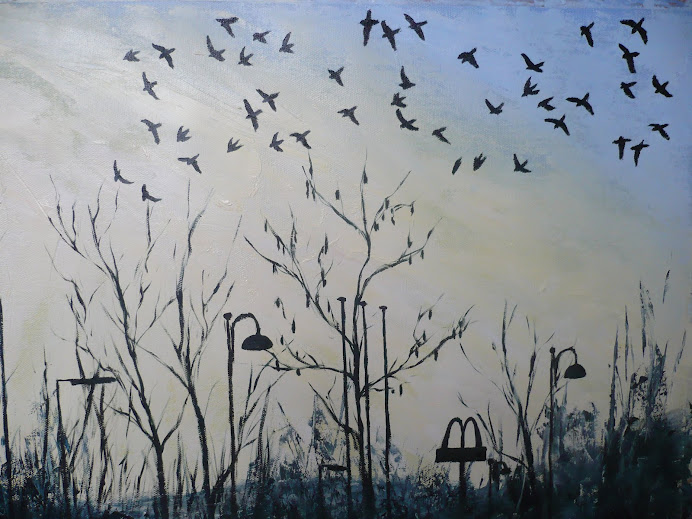
 Maybe I should have used green as the underpainting colour because I've since read in a book called "painting portraits" by Rosalind Cuthbert that green was primarily used because it was a
contrast colour to the warm tones on top, plus it was able to effectivly portray areas of veins, especially on the hands.

No comments:
Post a Comment