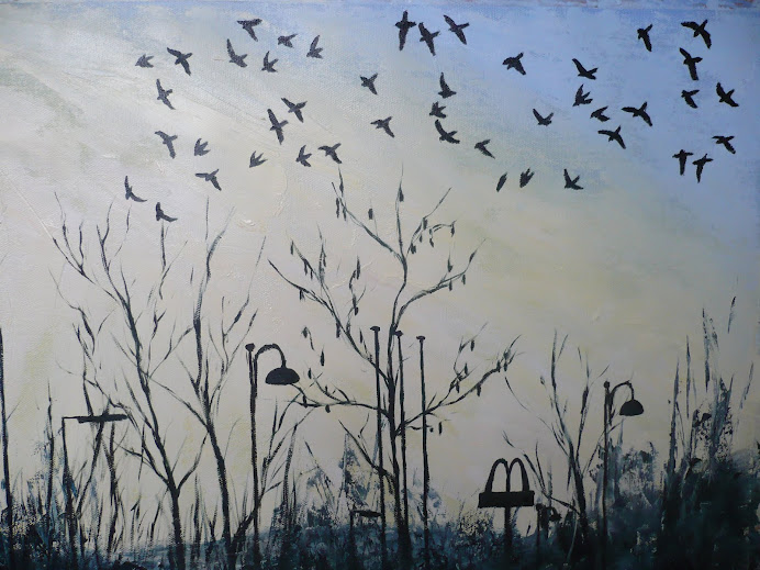
 I have to say I'm really happy with the success of this image and am pleased with how far it's taken me out of my comfort zone as I'm more accustomed with painting in detail.
This final stage saw me adding splashes of colour to the darker areas in the top right and bottom left hand corner, similar to the splashes of green in the watercolour sketch. This has helped to lift the darker areas whilst also emphasising their tonal differences. When compared to the previous photo the contrast is quite large.
The use of collage as a technique is one that I will definitely use again, as the possibilities are vast especially when used in combination with paint. In my sketchbook I've experimented with more abstract images plus landscape compositions and in a way this final image here is like a cross between the two, there are elements of abstract and natural representation within it.
The one area of weakness that I can see in the final piece is that maybe the composition is slightly too straight forward. The flowers are laid out in two horizontal rows, and maybe there could have been more movement here. I think this fault has come about by not planning enough at the beginning stages, and laying the coloured paper areas out without considering their relation to each other in the composition. Once it got to the stage that I could see there was a slight problem I didn't feel confident enough to be moving the areas around without affecting how it already looked. There is a fine line between chaos and order and maybe the beginning stage was a bit too random, so I will know to plan more in the future. However the dynamism of the paint and collage effects more than makes up for the slightly tame composition, in my opinion.

No comments:
Post a Comment