

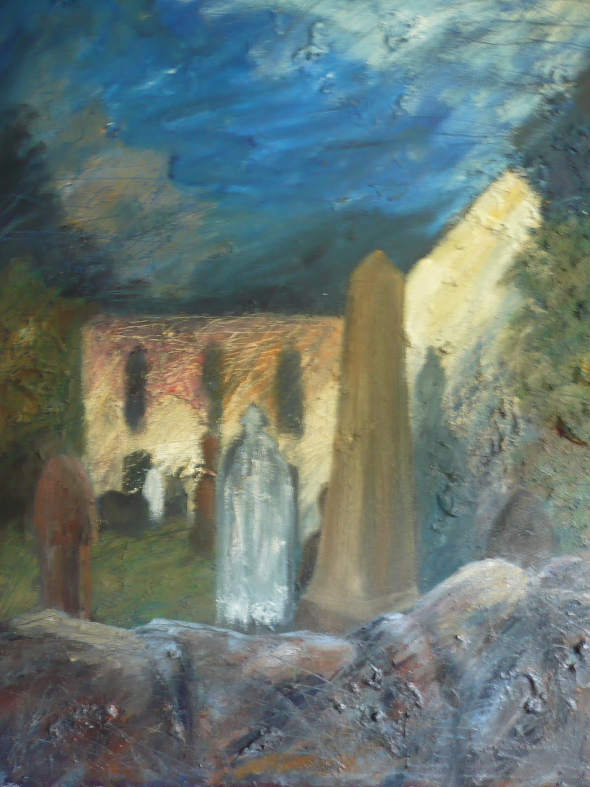
 It's been a while since my last entry because I wanted to make sure the base layer of paint was dry before started painting on top of it. I didn't want any wet on wet dragging effect, but wet on dry so that I could get a scumbling affect and that the base layer of paint, either darker or lighter that the top layer, would show through underneath as it often does in Pipers own paintings. This can be seen in the close up of the front of the building.
The close up of the stone wall shows how the chunks of dried paint which I added to the canvas in the early stages of the painting have now been integrated into the whole image, with both adding on more layers of sticky paint, plus scrapping back. This has helped it to look more organic, and not so artificial; it's a technique I'll remember for the future.
The colours themselves have changed since the last photo shown here, some bits are lighter, like the building which gives it a spotlit effect as used by Piper, then the sky is darker, with patchwork areas of colour to break up the expanse of blue. The painting of Piper's which I used for this arrangement of colour in the sky is Seaton Delaval, used on the cover of the book "Lives in Art" by Francis Spalding which I've been reading and will write about here soon.
The skyline has also changed because I decided to get rid of the hills in the distance. I didn't really know what to do with them, give them colour or make them dark or light, so in the end I decided they weren't really adding anything to the composition and could go, so I covered them over with the new colours used for the sky and I much prefer this new dramatic skyline as it makes it look like smoke rising above the building.
The other area where the colours have changed is the trees, which I'd also wondered what to do with. But I found that the bright colours were too out of sync with the building, so I decided to give them a more autumnal tone, more in keeping with the muted warm colours in the rest of the painting, and I've also scrapped them back in areas to show the brighter green underneath as this gives it more variety in both colour and mark-making.
I'm really fond of the colours used for the smoke damaged part of the building, because even though they may look a little artificial, and they were again inspired by the vivid colours used in Seaton Delaval, there are actually hints of pink and orange in the paint work of the building in real life that were affected by the heat of the blaze. I feel that the final image works really well as an integration of the style of John Piper, plus representing expressively and accurately a real building in its ruined state.
(Added April 12th 2011) I've since found this on a website featuring information on the town of Tonyrefail, where I live. It gives some interesting images and information on the building before and after the ruined state. http://tonyrefail.org/inferno.html
No comments:
Post a Comment