Jackdaws At Dusk

Jackdaws At Dusk

Tuesday 30 August 2011

The Final Painting


With so many different techniques and technical problems to get used to, this was without a doubt the hardest painting to get right.


An unusual aspect with defining the portraits of the figures was the fact that I could only paint the lightest part of the features, as the paint underneath was representing the shadows on the faces, and this was quite tricky to get used to.


Having read Man With a Blue Scarf recently, which is an account by Martin Gayford of posing for a portrait by Lucian Freud, Gayford includes a section from a 1954 article in Encounter where Freud explains his thought processes behind painting a portrait;


"The artist who tries to serve nature is only an executive artist. And, since the model he so faithfully copies is not going to be hung up next to the picture, since the picture is going to be there on its own, it is of no interest whether it is an accurate copy of the model." (Gayford, 2010, p.48)


It must be said that the figure on the bottom left of my painting is the only one who actually looks like the person I was trying to depict. The other three only have a passing resemblance. So it was a reassurance to read the words of Freud with regard to getting a likeness. It allowed me to concentrate on other aspects of the painting, such as atmosphere, colour and tone.


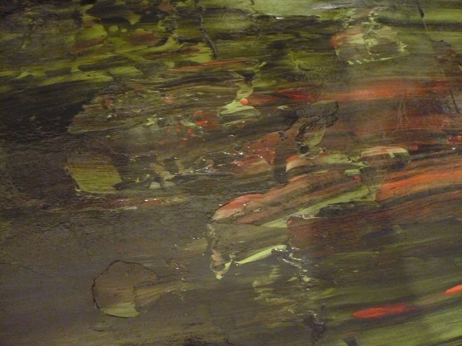
The three dimensional aspect of the painting is obviously difficult to get across in a photo, which is why I tried to take these photos from a lower angle, it can be seen in some places where the pond weed can be viewed both below and above the perspex, which I think is the most effective aspect of the painting. Scratching through the top layer of acrylic was also used to suggest the forms of the grass and this too has worked well.


There are many techniques and ideas used and discovered during the making of this painting that I hope to carry forward into future paintings and future courses.

Gerhard Richter in the Tate Modern


These are two of my logbook pages sketched and annotated when I was in the Tate Modern on the 13th of August. Above that is a photo of the room in the Tate, featuring paintings Cage 1 - 6, 2006, copyright the Tate Modern.

Seeing the paintings by Richter in the flesh was very different to what I expected them to be. There were a lot more variations and subtleties of colour that the photos of his paintings don't bring across. Two out of the three of my sketches - the green one and the yellow one - can be seen in the photo of the gallery, but the oranges and reds in these paintings seem to have been lost in their translation to photographic image.

The paintings really are enormous, I'd estimate about seven foot by seven foot, there were six in total in the room, two on each of the wide walls and one each on the narow walls. It made sitting on the benches in the middle of the room, where I sat for about an hour, feel like you were sitting in a goldfish bowl, or under the sea, surrounded by water on all sides. It validified my decision to include his work as reference for my under water painting.

Saturday 27 August 2011

Embedding the Perspex into the Canvas


Once I'd outlined the figures onto the top layer on perspex I could start applying the pond weed to the bottom layer. I did this by painting roughly with a small sable brush then rubbing over it with oil pastels. I then splattered green and brown acrylic paint to represent small parts of duck weed that grow on the surface of the water.


Once I was happy with this bottom layer I started preparing the canvas. I sized, but didn't prime it - as I wanted the paint to be able to breath and not be sealed in by layers of emulsion. I then painted a base coat of brown paint so that the white canvas wouldn't show through. This photo on the left shows acrylic paint squeezed onto the canvas, along with white PVA glue.


This second photo shows the paint once it had been scrapped across with the plastering tool. The reds and greens are contrasting nicely and help to lift the browns and blacks from looking too muddy.


Embedding the perspex into the canvas was an interesting process as it was surprising how many air bubbles got trapped underneath and how much effort was involved with forcing them out. I'm glad that I didn't prime the canvas now because the tiny gaps left in the canvas allowed the air to be pushed out through the back easier than if it had all been sealed with paint.


This close up shows the interesting effect of the flickers of colour from the dried paint on the perspex reacting with the wet paint on the canvas. It reminds me of a nebula.


Starting the Final Painting for the Group Portrait

This is the first stage of the final painting. This photo on the left shows the A2 acrylic study painted onto card on the left, with the beginning of the perspex painting the right. I used the large study as an image to be traced onto the perspex by laying the perspex sheet on top of the large study and drawing around the image with oil pastel. I worked on it this way because alterations that needed doing on perspex were much harder do than alterations on paper.

Once the oil pastel had been drawn on I applied the first coats of acrylic paint onto the perspex, using the same kind of brush strokes as Miro in his oil on copper paintings, using a hog's hair brush so that each one of the brush strokes would be visible.


Varnishing the Perspex

There was one more logistical problem with painting onto perspex; the acrylic paint was very easy to scrape off. This was a big problem because of the durability needed for a painting that would be sent through the post for assessment. The only solution that I could think of was to coat the perspex and acrylic paint with a layer of acrylic varnish, but this itself threw up a problem because it resulted in less transparency through the perspex.

This photo on the left shows the small perspex study on the top, with an unpainted sheet of perspex sandwiched up against it underneath. The small study has been varnished, whilst the unpainted sheet has been varnished on only one side - the left hand side. It can be seen that there is a cloudy sheet masking the black paint underneath. I think the varnish on the painted study is slightly more cloudy because the acrylic paint hadn't dried for the full 24 hours before applying the varnish, and so it smudged slightly.


The poor visibility from the acrylic varnish is made even more obvious by the way it distorts light when looking through it into the distance, as in this photo on the left.

However, I've come to the decision that this distorting effect is actually quite appropriate for a painting depicting water in a pond, after all when is pond water ever crystal clear? For the parts of the perspex painting that are left free of acrylic paint, the varnish will act as a thin veil separating the lower levels of paint from the upper levels of paint.

Thursday 25 August 2011

Sample on Perspex


Having never painted onto perspex before, I wanted to be sure that the logistics of it were thought through before starting the full size painting. My plan was to incorporate three layers of paint - the canvas, the front of the perspex and also the back of the perspex - but I wanted to make sure that painting on the back of the perspex would actually contribute something constructive to the image.

This first photo shows one of the portraits roughly painted onto the front layer of perspex. There are strands and splatters of green on the back layer, representing the pond weed, whilst the dark paint underneath is a layer of canvas painted with acrylic, representing the mud. I was satisfied at this stage that these three layers worked well together.

Logistically I had a problem with how to stick the canvas and perspex together to made a solid and sturdy whole. Initially I'd thought to use glue around the edges, but this didn't seem satisfactory as I thought the glue would be visible. Researching further into the work of Brendan Stuart Burns, who also uses perspex in his aquatic paintings, I decided to emulate his technique and completely embed the perspex in paint, thereby using the paint as an adhesive.


This second photo shows the thick layer of paint that was prepared ready to embed the perspex into. I mixed in a lot of PVA glue to make absolutely sure that the two surfaces would bond (Burns also uses wax in his oil and perspex paintings which contributes to the adhesive properties).

This third photo shows the plastering tool, used as Gerhard Richter does, to drag the paint across the canvas - it also served to mix the paint and glue together, creating an even distribution of glue.

The final photo shows the small study embedded in the paint. The effect that I'm most pleased with is that the bottom layer of paint still looks wet and fluid. This is very different to the study shown in the first photo above, where the texture of the canvas can be seen through the transparent perspex. Though the full three dimensional effect isn't noticeable in a photo of the study it is very effective when seen in the flesh. The perspex itself is 5 mm thick, so there is quite a contrast between the front and the back layers, mimicking the effect of looking through water. Seeing the three layers of paint interacting together validated my decision to paint on the back of the perspex, as it would have been impossible to paint the strand and splatters of pond weed onto the wet layer of paint used on the canvas.


Sunday 21 August 2011

Painting on Copper


Joan Miro The Two Philosophers Oil on copper. 1936. Image from the MoMA website.


Painting onto perspex has brough up an issue that needs to be dealt with - should I camouflage the brush strokes or incorporate them into the texture of the painting? In my small perspex study I tried to camouflage the marks by smudging them with a cloth and spraying with water so they would blend together. However seeing this painting by Joan Miro on display in the Tate Modern made me think that incorporating the brush strokes would be worth experimenting with.


The Two Philosophers is painted with oil on a sheet of copper which creates a completely smooth surface for the paint to glide on and prevents the paint from sinking in, therefore each one of the brushstrokes is clearly visible. This smooth non-porous surface is very similar to a sheet of perspex, so it's a technique that I'll be including in my work.